Ramblings, findings, opinion and the occasional fact.

Latest: Johnson&Jonson rebranding

#12 Christmas cards or holiday emails?

There are more important things than efficiency. Christmas emails may be easier than writing individual messages by hand, but there is still something to be said for old-fashioned pen to paper

Most of us would contend that, intellectually, design is all about the ideas and the new ways of looking at things. The larger a studio becomes, however, the more it feels the need to plan the creative process. They monitor people with time sheets, have lots of planning meetings and give everybody fancy titles to create false hierarchies. When you see what the bigger studios turn out, it is clear that their measure of success is not the quality of the end product, but the smoothness of the production process. Efficiency trumps effect. 

This totally distorts the reality in our profession. Our clients do not judge our work by how it came about, but by how it works for them. Is their brand stronger after the redesign? Does the product sell more? Is it manufactured more cheaply and swiftly? Whether we get there by working day and night or with handmade software, under the influence of substances or by being exposed to loud music, nobody cares, as long as the client is happy. They presumably come to us for the quality of the design, whether we work as offices, firms, ateliers, agencies or studios. 

If efficiency of process becomes the most important goal, the quality of work will eventually be compromised. 

There are, of course, many areas where we need to be, and can be, more efficient. Sending emails instead of hand- or typewritten letters is much more efficient. After a telephone call we often don’t remember half of the things that were said, and we certainly couldn’t prove any of it if we had to. And one can – and should – take a minute before hitting that send button to think again, whereas on the phone we may say things that we regret the minute they’re uttered. 

Inviting more than one person to an event, making an announcement to a group, communicating from one to many: electronic mail is the perfect tool. There are, however, still occasions where we don’t want the recipient to feel that he or she is just one of many, even if the software cleverly inserts their first name above the message. Even spam comes addressed to us personally, so that doesn’t fool anybody anymore. 
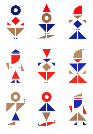
Christmas cards may be printed in runs of millions and bought by each of us in large amounts, but we still at least write the address by hand, perhaps a short personal message and then sign it, if only with an illegible scribble that betrays hours of practice. The tradition of writing Christmas cards has turned into an annual avalanche of add-ons: artificial snow in envelopes, ingenious cardboard constructions that take half a working day to unfold (and often even longer to deconstruct), strange interpretations of seasonal trees and untold other combinations of red, gold and green. Yet the actual idea of writing a personal note seems more appropriate than ever. 

Environmental bean counters must have worked out that the exchange of printed and other surface-enhanced artefacts at yuletide cost mankind the equivalent of at least one day‘s automobile traffic across the globe. Admittedly, at times just before the holidays, I do feel like I am under attack by the content of my letterbox, but generally: what is wrong with writing to each other? 

In human terms, Christmas spam is a far worse option. This year, we are sending you a festive email only, in order to save the rainforest from extinction by Hallmark and its allies.’ What a lame excuse for not wanting to sign a few hundred cards! If we feel that nobody appreciates so much postal attention all at once, why not write simple postcards during the year, even to clients and colleagues? With all our electronic gadgets spitting out more and more instant gibberish, actually sitting down to write a short message by hand, perhaps even with a fountain pen, is not only therapeutic for the writer, but also incredibly effective when it comes to establishing relationships. 

And shouldn’t we strive for relationships, even with our clients? Personal postcards are still a symbol for the fact that somebody thought about us, took the trouble to look up our address and actually spell it out. As long as there is no fountain pen with a copy-and-paste function, this is one-to-one communication.

Christmas emails may be more efficient than writing individual messages by hand, but I bet the postcard is a hundred times more effective.

#11 Künstler und Handwerker / Artist and Artisan

Architekten, Bildhauer, Maler – wir alle müssen zum Handwerk zurück! Denn es gibt keine Kunst von Beruf“. Es gibt keinen Wesensunterschied zwischen dem Künstler und dem Handwerker. … Die Grundlage des Werkmäßigen ist unerläßlich für jeden Künstler. Dort ist der Urquell des schöpferischen Gestaltens.

Architects, sculptors, painters – we all must return to craftsmanship! For there is no such thing as art by profession.” There is no essential difference between the artist and the artisan. … The foundations of proficiency are indispensable to every artist. This is the original source of creative design.

Walter Gropius, aus dem / from the Bauhaus Manifest 1919

#10 Be quiet

Perhaps noise pollution is a First World problem. While it is certainly not as high on the agenda of environmentalists as other hazards, it should be. I always presumed that architects and interior designers knew how to deal with excessive sound, aka noise. Apparently, however, it is still often equated with liveliness and energy. How often have you sat in a restaurant with tiled floors, metal tables and stone walls? Cool to look at and and appropriate for short order cooking, but impossible to hold a conversation, unless you blare into your cellphone, as tends to be the case, even if there are two people at the same table. I never know whether the designers of these places don’t know that a piece of felt underneath the tables will already break some of the sound waves or whether the restaurant owners want people to leave quickly as soon as they’ve finished eating. 

In the US, certainly in my experience, a quiet restaurant is impossible to find; what a European like me finds to be hectic and noisy is deemed to be lively and happening. Mind you, this is the same place where nobody wants to be found doing only one thing at a time. In order to be seen to be active and with the times, you have to be on the phone with a cup of coffee in your hand while driving or walking. Walkie-talkie coffee-drinking pedestrians are a major hazard already in our cities on both sides of the Atlantic. Can you imagine what that will be like when electric cars will be quietly approaching? As a cyclist, I am already used to having one hand on the brake at all times because one of those smartphone zombies is bound to walk in front of me at any moment.

The ubiquitous headphones and earplugs are not only signs of a multi-tasking populace, but also a tacit (sic) reaction to the very cacophony all these one-sided conversations cause. A pictogramme depicting a crossed-out mobile phone has been around for a few years and serves as a reminder in railway cars and waiting rooms that noise can be just as unwanted as second-hand smoke. 

I witnessed a posse of enraged passengers on a train recently, protesting the clacking of someone’s fingers on a keyboard. The conversation (which certainly broke the silence in that compartment) revolved around the question of how quiet quiet” meant. There wasn’t a no-mobile-phones-here pictogramme on the walls, but simply a notice Quiet Car”. Did that mean the absence of any sound beyond normal signs of life, like breathing? Or did it mean to disallow sounds emitted by manmade objects only? Would you have to move to the corridor to cough or sneeze? What if you rustled a paper bag? It turned out that all the passengers frequenting that car went there to avoid noise, and after the (well-mannered) discussion we all agreed that one man’s keystrokes could be another man’s steamhammer. While typing on a touchscreen may not be as convenient as doing so on a proper keyboard, it may be quiet enough to satisfy this ever-growing demand for a quiet space, one where you can hear yourself think.

Don’t get me started on modern inventions like the bleeps made by reversing trucks and vans these days! Why do they always have to announce their change of direction at 6 in the morning? Mind you, with electric cars not having exhausts to inform the world around them of their amazing amount of horse-powers, we may be in for bleeps and other signals from cars simply moving forward. Whole neighbourhoods will have to erect Quiet” signs and noise-makers will get their designated spaces, having to huddle underneath glass shelters like smokers do already.

(Icon from the Isotype collection)

#9: Of Chief Pencil Sharpeners and Senior Meeting Conveners

A study about the economic situation of the design profession in the US listed six hierarchies for the positions in an average design firm: owner/partner/principal; creative/design director; art director; senior designer; designer; junior designer. This reasonable list attracted a lot of attention online, with large agencies submitting their lists of up to 18 levels of titles in the design department alone – from Junior Designer through Copywriter and Media Designer to Chief Creative Officer. Not only does this take on inflationary proportions, rendering them increasingly meaningless, but there is also a contradiction in the terminology: Some of the titles denote where someone is placed within the ranks of their company, while others explain what they do there. Titles, roles and job descriptions are all confused. As I learnt from my mother early on, unprecise language indicates unclear thinking. 

What, then, makes an agency use such confused language, which they would never tolerate in a client briefing? Their employee’s vanity? And what of designers who have progressed to Design Director after a few years, only to have entered the end of the career street? And if you want to name a dozen hierarchies, you need three times that many employees. Which is why small studios love to fake it by giving an impressive title to every intern (how about Research Assistant?), while the cleaner is upgraded to Vice President of Recycling Operations. And even in Germany, those titles have to be in English, the more to impress gullible clients with. Unfortunately, the Chief Design Officer sounds very much like a military rank in German. The people who are most impressed by this sort of language tend to be the ones who cannot really speak it. 

Apart from designer vanity, another reason quoted for titlemania is often the fact that clients would rather call a Design Director than a lowly designer. The director gets paid for taking the call and then relays the message to the lower levels who do the actual work. In the real world, however, teams are neither run nor dominated by the people with the top title, but by those who command the highest respect from their peers. 

Unfortunately, the soundest teams often tend to take on new colleagues only if their competence is below the group’s average. Over time, everybody in a small team will have risen to Senior Designer level at least, but at the expense of design quality. The desire to keep the status quo tends to be stronger than that of taking risks. Designers, too, fall victim to the Peter* Principle: Employees within an organization will advance to their highest level of competence and then be promoted to and remain at a level at which they are incompetent.

* After Laurence Johnston Peter (1919 – 1990).

#8 The spiekileaks typeface

There are good reasons why the form of the book and the type we read most comfortably haven’t changed very much since the 1500s: Our eyes are still next to each other and our hands still hold a book (or a tablet, for that matter) a certain distance away from our face. They can only comfortably hold an object that fits them. That’s how coffee-table books got their name: you cannot hold them in your hands but have to rest them on a table. Which actually means that you do not read, you rather just look at them. Books for reading are never wider than two hands next to each other.

When I design and typeset books, I tend to go for the typefaces that people expect for reading long, continuous text – never too far from the Garamond / Caslon / Bodoni models. Those early standard faces have been reworked often, first for machine composition in the late 1800s for Monotype or Linotype, then again for photosetting in the 1960s, and then once more as Postscript type in the 1980s. Not every revival had been carefully done, nor did it consider what the original purpose and technology had been. Recently, however, we’ve seen a number of very successful revivals that are more than another re-drawing of old shapes, but an evaluation of what the original idea might have been, what the technical and physical constraints were, and how we would assess a similar brief with today’s sophisticated type-design tools. In other words: what would Claude Garamond (or, in fact, Robert Granjon) have done with today’s tools?

I now have a set of favourite fonts that I am familiar with and whose designers I usually know. It feels good to license and use fonts from designers who actually make a living that way. Among these favourites are Lyon by Kai Bernau, William Text, a new Caslon by Maria Doreuli, FF Hertz by Jens Kutilek, FF Franziska by Jakob Runge, Guyot by Ramiro Espinoza, Arnhem by Fred Smeijers, ATF Garamond by Mark van Bronkhorst, Equity and Century Supra by Matthew Butterick, the new Walbaum by Charles Nix for Monotype.

Recently I came across a new typeface by Kris Sowersby, called Signifier. It started out as a revival based on one of the Fell Types, a curious set of types that were brought back to England from the Continent in the 1670s. Amongst them English Roman, by an unknown punchcutter, caught Kris’ attention. He started digitizing it, hoping to capture its qualities, which he calls dark and assured on the page”. Taking into account ink, pressure, paper, and the fact that those letters were cast by hand, every impression of the same letter can be quite different. Which one, then, is the most faithful one, the true source?

Most revivals try and imagine what the original punchcutter’s intent might have been. And what would he have done with digital tools? Kris decided he didn’t want just another double-guessed revival, instead asked himself what an honest digital approach would be. His answer: Brutalism. Yes, that style of architecture we equate with large buildings, made of concrete.

The real meaning of Brutalism, however, is not the material as such, but the question: what can it do? Digital letterforms are free of any formal constraints. Curves can be infinitely precise, corners incredibly sharp. Early digital fonts would blunt some points and straighten complex curves to anticipate the destruction during output. Today we understand that at small sizes sharpness is corrupted by scaling and rasterisation anyway, regardless of the substrate the letters are displayed on – they look as if they had already been drawn with softened tips and simplified curves. The sharpness is theoretical. Only math is infinite, while the physical world has limits.

Look at the Signifier drawings and you see a digital font. Read it in text size and you see a traditional Old Style typeface. We use laser light to burn pixels into polymer, project pixels to a glass screen or burn them onto aluminium plates. Those tiny dots add up to form letter-shapes that look just like the not-too-sharp and thus pleasant type we’re used to from old-fashioned analog typesetting. Printing takes curves drawn with equations, transmitted by light, and makes them back into things that we can run our fingers over.


*The photo at the top shows a title from
the other collection, books produced post-digitally, i.e. typeset on a computer, data transferred to a polymer plate and then printed letterpress on an Original Heidelberg Cylinder from 1954.

#7: Symmetry

Everybody likes symmetry. It provides order, doesn’t need expert knowledge to recognize and promises easy access. While my German self loves this look of order, I get bored very quickly when things are so predictably arranged. 


On balance, so I have concluded, symmetry may be a bad thing.
Loved by dictators, shunned by libertarians,
the perfectly symmetrical place simply doesn’t feel right.
Symmetry is easy.
Putting a picture or a line of type smack in the centre of a page
is an easy default, aided and abetted by software
that provides guidelines to snap the element into position.
Centred arrangements in typography are predictable and static.
If they are well-done, they look decorative;
if not, they come across as authoritarian.
Symmetry is boring. 

After the First World War, artists and designers felt the need for more dynamic expression, symbolizing progress, the future. They turned to asymmetry. Some of the statements from movements such as Dada or the Futurists sounded as if asymmetric layouts were the solution to end strife and struggle. Printing pamphlets, books and posters designed according to the new rules of typography would, somehow, make the reading public ready for a new society. Centred arrangements were seen to represent the old order, a kind of typographic monarchy, with things becoming less important from the top down.

Designing plans for a city is like arranging toys, with architects playing God. The easiest thing is to place everything symmetrically, following a grid, be that made of squares or concentric circles or both. One look from above (which wasn’t so easy before aeroplanes or Google Earth) at Versailles or St Peter’s Square shows how tidy these plans are. From the ground, however, the impression ordinary people – everybody except architects – get is one of feeling small and insignificant. Which was exactly the effect both the absolute King of France and the infallible” Popes wanted to achieve. Disagreement, let alone contradiction were not options with this architecture. Hitler’s Nazi party rallies in Nuremberg also celebrated absolute symmetry, as did his and Albert Speer’s plans for post-war Berlin. Cities that need centuries to grow, ending up full and messy, did not suit the plans of the dictators who wanted to exercise and express absolute power in their lifetime. No wonder, then, that the public spaces planned and built by the likes of Louis XIV, Hitler, Stalin and Kim-Il Sung never have cafés lining them.


Now take a look at the spaces that do make us feel at home, make us want to spend time sitting in cafes and watching children play. They are all asymmetric. The Grand Place in Brussels, although rebuilt at the height of absolutist rule, is slightly curved on all sides of its rectangle. You would never know that if you stood in the middle of the large square, looking at all the grand buildings with their impressive facades. The syntax of its construction is not evident, but somehow the scale feels just right. 

The best example for a large public space with human proportions is probably the Piazza del Campo in Siena, the city’s beautiful scallop-shaped market square. Not only do the buildings follow a very weird curve around its perimeter, but the square’s floor is shaped like a shallow bath-tub. If you set out to walk towards the tower of the Palazzo Pubblico which dominates the space, you soon realise two things: it is nowhere near the centre and its entrance is a whole floor lower than the street surrounding the square. It takes a lot longer to get there from one of the cafes around the side than one first thinks, because of the way the floor is shaped and the distance is visually foreshortened by lines of stone that fan out from the tower side of the square. If you travel to all the other famous cities in Italy, you’ll soon notice that all their central squares feel comfortable because they follow the same pattern: they always dip at some point, never have a geometrically measured centre and always have a circumference that defies easy definition from a pedestrian standpoint. Why is it that the English language only has the word square” to describe these places that aren’t?

A page can also be seen as a square in the architectural sense. Its elements are letters and words, line spaces and margins instead of buildings and blocks, streets and squares”, and it is always easy to arrange them all in a predictably symmetric manner. To make a page feel approachable and eventually easy to read, these tectonic elements need to find their natural position. Language has its own rhythm, and as typography is visual language, a designer has to understand that rhythm in order to express it with black and white marks, with words and the spaces in between. Pure symmetry will hardly ever do.