#15 Passion / Leidenschaft
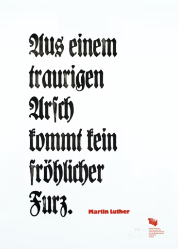
Nowadays political correctness forbids certain useful formulations that go straight to the point. It’s a good job we’re still allowed to quote. I will borrow the words of Martin Luther, A sad arse will never produce a happy fart, to make it clear that work output is directly influenced by feelings. In the case of idleness – officially classed as one of the seven deadly sins – this is pretty obvious. Passion is its exact opposite, and by rights ought to be regarded as a virtue. However, its uncontrollable effects are too risky for any catechism.
I’ve appointed many hundreds of people since I’ve been commercially active as a designer. I cannot remember anyone’s school reports or diploma topics, in fact I very rarely dealt with them at all. What I do recall are the ones who were really eager to work with us. They wanted to do their work well, convince unenthusiastic clients, perhaps even change the world a tiny bit. I have always chosen people for their attitude, not for their papers. Needless to say a design office also needs Bézier curve benders and Photoshop twiddlers, but even that sort of unglamorous technical work can be exciting when done passionately.
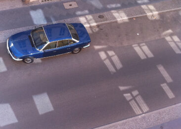
I’ve driven the same car for the last 35 years. Every two years I take it to the same mechanic who loves nothing better than making sure classic cars are kept on the road. Bicycles can be equally passion-inspiring, to see the world from a bike saddle. And my friends and colleagues know just how hard it is to get me to shut up when it comes to talking about type. They also know that my love of such a dry subject means I always want to be kept informed about what’s new, and never get bored of answering the same banal questions. All this is an expression of a passion for something which may produce some peculiar symptoms but is not directly infectious and definitely not dangerous.
People one level up from being passionately interested in a subject would be called geeks – those with intensified one-track interest. The word originally applied to computer programmers and other technical experts. Although geeks may be extremely focussed on their subject, they haven’t yet lost all of their social skills. A geek may even be capable of real passion.
Further along the line we have nerds. Nerds are interested in one thing only, and know all there is to know about it. However, their lives consist of little else and they can only talk to other nerds about their shared obsession. Emotions such as passion are alien to them and are treated with suspicion. At least this inability to be thrilled prevents them from doing any damage. When passion gets out of hand it turns into its evil cousin: Fanaticism. Hate is only a step away, when enthusiasm for one thing becomes a tool to use against other people. Fanaticism is passion without tolerance. ★
Leidenschaft
Politische Korrektheit verbietet heutzutage manche Formulierung, die etwas knapp auf den Punkt bringen könnte. Gut, dass man immer noch zitieren darf. Ich nehme mal das Wort von Martin Luther: Aus einem traurigen Arsch kann kein fröhlicher Furz kommen um deutlich zu machen, dass menschliche Gefühle unmittelbare Auswirkungen auf das Arbeitsergebnis haben.
Seit ich Gestaltung als kommerzielle Tätigkeit betreibe, habe ich viele hundert Leute eingestellt. An Zeugnisnoten oder Diplomthemen kann ich mich bei niemandem erinnern – in den seltensten Fällen habe ich mich überhaupt damit beschäftigt. Wohl im Gedächtnis geblieben sind mir die Leute, die darauf brannten, bei uns zu arbeiten. Sie wollten gute Arbeit machen, auch unmotivierte Auftraggeber überzeugen, vielleicht sogar ein wenig die Welt verändern. Ich habe immer nach Haltung eingestellt, nie nach Papieren. Natürlich braucht ein Designbüro auch Bézierkurvenbieger und Photoshopfummler, aber selbst solche handwerklichen Arbeiten können aufregend sein, wenn sie mit Leidenschaft betrieben werden.
Seit 35 Jahren fahre ich das gleiche Auto und bringe es alle zwei Jahre zum gleichen Schrauber, der nichts lieber macht, als dafür zu sorgen, dass klassische Autos auf der Straße bleiben. Von solchen Leuten sagt man, sie hätten „Benzin im Blut“. Genauso leidenschaftlich kann man sich für Fahrräder interessieren und die Welt nur von einem Sattel aus sehen. Wenn man mit einem Fahrradfreak zu tun hat, bei dem jedes Gespräch auf die technischen Eigenheiten der Achtgangnabe hinausläuft, kann ein solcher Tunnelblick mitunter albern wirken. Aber wenn ich etwas wissen will über Fahrräder, rufe ich diesen Freak an.
Wie schwer es ist, mich zum Schweigen zu bringen, wenn das Thema Schrift zur Rede steht, wissen meine Kollegen und Freunde. Aber sie wissen auch, dass die Begeisterung für eine so trockene Angelegenheit dafür sorgt, dass ich immer auf der Höhe bleibe, ständig wissen will, was sich tut und nie müde werde, auch die banalsten Anfragen zu beantworten.
Weil der Gegenstand meiner Leidenschaft ein Thema ist, dass die meisten Mitmenschen überhaupt nicht verstehen könne, werde ich mitunter als „Nerd“ eingestuft. Dieses recht neue Wort beschreibt jemanden, der sich für eine Sache interessiert, davon viel versteht, aber am normalen Leben eher weniger teil hat. Nerds können über ihr Ding reden, aber das nur mit anderen Nerds. Gefühlsregungen wie Leidenschaft sind einem Nerd allerdings fremd, sogar verdächtig. Damit wäre der Nerdverdacht von mir gewendet.
Menschen, die fähig sind, leidenschaftlich für eine Sache einzutreten, egal wofür, haben ein Gespür dafür, dass es auch Anderen so geht. Ohne diese Erkenntnis ist es nicht weit von der Leidenschaft zu ihrem bösen Bruder, dem Fanatismus. ★