#25 New Type for New Thinking

TOC 9, the next book for TOC The Other Collection, is Wolfgang Eilenberger’s Time of the Magicians – The Great Decade of Philosophy 1919 – 1929. The original book was written in German and the translation keeps many words and concepts that are difficult or impossible to translate, like Sein or Dasein or even more difficult: Es gibt. No point trying to explain those expression here – just get the book. A lot of the protagonists are German: Benjamin, Cassirer, Heidegger, Wittgenstein and others appear, while Hegel, Nietzsche, Kant et al are frequently quoted.
The decade after World War I was exciting, messy, wild, new. The survivors of the terrific fighting in the world’s first fully mechanised war had often been wounded and traumatised. It was a time to explore how human thinking might have to be re-invented and how the world should be re-built. Art, design and architecture were re-imagined – the Bauhaus in Weimar and Dessau defined those movements, including a new look at type and typography.
Shouldn’t a book about New Thinking be set in a New Typeface? New ideas about typography also reflected new thinking, integrating images and finding its own expressions, away from ornamentation and decoration.
The Bauhaus experimented with new typefaces, but never managed the step from theory and sketches to working, legible type. It took until 1927 for the first really new typeface to be released, appropriately named Futura and advertised as the Type for the new Age – Die Schrift der neuen Zeit.
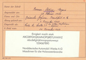
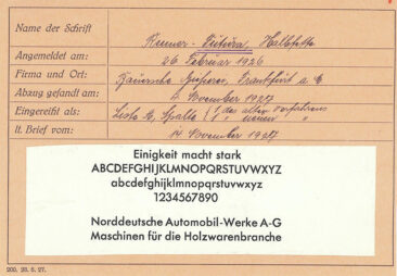
The registration with the Association of German Typefoundries from November 1927 shows it as Renner-Futura, named for its designer, Paul Renner. The version intended to be used for long text in books and magazined was Futura Buchschrift, released much later, in 1933. It was made available for all line-casting machines of the day – Intertype, Linotype, and Typograph, making it suitable for setting books and other long text.
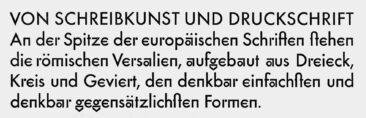
Its radical departure from the traditional serif faces hadn’t initially suggested its use for long text. German books, newspapers and magazines were set in Fraktur, with only foreign languages and names in serif type – which the non-German world called Antiqua.
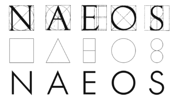
Renner’s capitals are Roman capitals, its serifs and the contrast removed. He himself called Futura a Serifenlose Antiqua – a non-serif Roman.
The illustration of the basic geometric shapes – square, triangle, circle – is a nod to the Zeitgeist which was trying to make new typefaces just using those shapes but which never yielded any usable text faces.
The books I have so far designed for TOC are set in traditional serif faces, albeit those that are digital re-interpretations by today’s type-designers. Futura was the obvious candidate for this text which looks at the first decade after WW1, but I could not remember seeing that typeface work in longer text, printed offset. Type is never black enough when printed with water, as offset does, and neither photosetting nor digital versions of Futura had managed to overcome the pale impression that its skeletal letterforms left on the page.

Then Kris Sowersby came to my rescue. He had already shown how to manage to revive a perfect typeface with his Söhne, a contemporary interpretation of my favourite typeface, Akzidenz Grotesk. And I had used his Signifier (also the type this column is set in) to set our third book, John Banville’s The Sea. I am in the middle of setting the Eilenberger book, using Kris’s version of the Type for the New Age which he calls The Future. I’m using the weight he calls Regular.

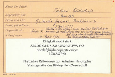
A Regular or Book weight did not exist when Futura was first announced at the end of 1927 (it wasn’t cast until 1928), there were only the mager (light), halbfett (medium) and fett (bold) weights. In 1933 Futura Buchschrift came out – appropriately named for setting long text. It was available for machine setting on all three existing systems: Intertype, Linotype, and Typograph.

When we print on our 1954 Heidelberg Cylinder press from polymer plates, we get exactly the same impression you would have seen when printing from metal type. Before I commit to a new, untried typeface, we print a signature – 8 pages – on the Heidelberg, from our polymer plates, and on the original paper. When I design for offset printing, I always look for a typeface with a good text weight because offset printing tends to make the type look lighter than it will do on screen or on an office printer. One of our favourite typefaces has therefore always been Kai Bernau’s Lyon: it features two weights for text: Lyon Text Regular and Lyon Text Regular No2. No2 has that little extra heft necessary for setting text sizes up to 14pt and printing offset. Printed letterpress on the Heidelberg, however, the lighter Lyon Text Regular will gain a little weight from the slight impression into the paper and the resulting blackness of the type. The two weights have to be different to appear the same.
Futura Buchschrift was designed for letterpress printing, because that is how books were made at the time, and it ended up looking slightly emaciated when photoset and printed offset from the 70s onwards. Some of that had to do with the design of photosetting fonts which had often been adapted from the original drawings – in theory a good thing, but usually not taking into account the distortions occuring during reproduction, plate-making and printing. The first digital types from the 80s after the arrival of PostScript technology suffered from the same malaise. Today once again we see fonts with size-specific design, sometimes made using the Variable Type format.
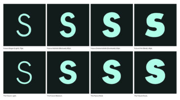
Kris did his homework when he designed The Future, and I’m expecting his version to show that this new Futura can be used for setting long text again, as long as it fits the topic and all the design parameters consider its simple yet complex character. Printing it letterpress will help give the Type for the New Age a new life. It certainly fits today’s requirements if handled well. ★