Ramblings, findings, opinion and the occasional fact.

neueSerie57: a new typeface, rediscovered from 1957

#20 A new, old typeface

Akzidenz Grotesk Serie 57, 28pt in a case at the Hacking Gutenberg workshop in Berlin


This new typeface
is neither a revival nor a reworking of an old type. It is a discovery – or rather a rediscovery. 

Of course I had seen Akzidenz Grotesk Serie 57 in the Berthold specimens and knew that the weights from 14 point onwards looked different from the smaller text weights, which had been made available for the Linotype. But I had never thought about the design process, even though 1957 was such an important year for typography: Helvetica, Univers! 

We do know that the first publication of a hot metal typeface rarely marks the beginning nor the end of a years-long process of development, but there must have been a reason why Günter Gerhard Lange chose exactly this year to name the face. 

The design of the text sizes for machine setting was not changed, only the widths were adapted for the Linotype system. They were available as early as 1957 and could be combined with the Akzidenz Grotesk weights for handsetting. But the spirit of the times wanted more of a system: the members of the AG family had never been coordinated, they had just come together over decades. Adrian Frutiger’s Univers, on the other hand, was designed as a system: tidy, comprehensive, modern, while Neue Haas Grotesk was not yet called Helvetica but had been planned to end the dominance of AG.
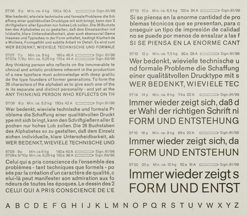

Akzidenz Grotesk Serie57
A spread from a Berthold specimen book


In 1959, AG 57 sizes from 14 to 48 point were released. GGL had caught the spirit of the times and tidied up, smoothed out and simplified the youngest child of the family. Unfortunately, it was never made into a complete family of faces. Until we discovered a mis-labelled case with AG 57 in 16 and 20 point

The neue Serie57® is not a revival, but a new digital typeface. It is dedicated to Günter Gerhard Lange, my teacher and role model. 

We printed a 64-page brochure describing the development process from the first digital version to the complete family which can be ordered from Alex Roth’s website here:


Our friend Stefan Nitzsche made a short video:

More spiekileaks:

13|07|2026
#36 Gutenberg-Preis 2026

08|07|2026
#34 Berlin ist gelb

07|07|2026
#35 You’re Doing Too Much; Design as Infrastructure

26|05|2026
#33 World Bicycle Day/ Weltfahrradtag: 3 June/Juni

10|05|2026
#32 Hacking Gutenberg’s workshop moves to a new studio: next door.

28|04|2026
#31 The Hand is the Window onto the Mind

01|07|2025
#30 Blandification

16|06|2025
#29 Townhouse zu verkaufen/for sale

16|06|2025
#28 Make great things again in 2025

16|02|2025
#27 Cut the meaningless superlatives or it’s through the window with you…

21|01|2025
#26 Die Ökonomie des Meckerns. The Economy of Complaining

18|02|2024
#25 New Type for New Thinking

28|12|2023
#24 Schrift: der unübersetzbare Begriff

19|12|2023
#23 Braun: eine Jugendsünde wird stilbestimmend.

15|12|2023
#22 God is in the details

08|12|2023
#21 Typography: History and Technology

06|12|2023
#20 A new, old typeface

30|03|2022
#19 A good User Interface

12|01|2022
#18 My biggest professional fuck-up

05|01|2022
#17 Typomanie und Bushidō

15|12|2021
#16 New! Improved! / Alles neu!

13|12|2021
#15 Passion / Leidenschaft

11|12|2021
#14 … they’re always lost / Es gibt nur Verlierer

09|12|2021
#13 The future is black and white

08|12|2021
#12 Christmas cards or holiday emails?

07|12|2021
#11 Künstler und Handwerker / Artist and Artisan

06|12|2021
#10 Be quiet

05|12|2021
#9: Of Chief Pencil Sharpeners and Senior Meeting Conveners

01|12|2021
#8 The spiekileaks typeface

22|11|2021
#7: Symmetry

18|11|2021
#6: The Leech Effect

17|11|2021
#5: The mean average

11|11|2021
#4: Language is currency

10|11|2021
#3: The first sentence is the most difficult one…

08|11|2021
#2: How to start a project

07|11|2021
#1: Spiekileaks intro