#22 God is in the details
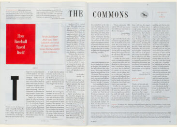
The Atlantic is one of my favourite magazines in the USA: a long read, well researched and well written. They layout is classic in a pleasant way. Type is Adobe Garamond Pro. All text is justified, and there start the problems. Very long reads are set in a 2‑column layout with approx. 65 characters per line is perfect for comfortable reading. Type looks even, with no large gaps nor uneven letterspacing. The 3‑column layout,however, already gets to look a little uneven: some lines look too loose because the hyphenation algorithm wasn’t adjusted to provide larger word spaces, opening up the space between letters instead. That can be avoided by changing the preferences, but I suspect the people doing the typesetting couldn’t be bothered to change the setting or simply don’t know that you can easily change the defaults.
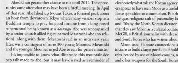


This lack of attention to detail becomes more obvious with the 4‑column layout. Less than 30 characters fit into a line, resulting in every paragraph showing some very loose lines with increased letterspacing, preceded or followed by dense lines, where the space between letters has been reduced. A paragraph then looks uneven, suggesting priorities that are not intended.
The remedy is simple: disallow changes to tracking (the space between letters) – neither tighter nor looser. Allow as extremes a fairly tight minimum word space and a generously large one, plus set the hyphenation to let words be separated even after and before just two characters. In narrow columns the eye can quickly return from a hyphenated end of a line to the beginning of the next one.
The best thing to do, however, is not to use justified setting: In my more than 50 years of designing magazines, reports, books, etc, I’ve found that most authors think that serious writing needs to appear in justified setting. I don’t know whether schools of journalism teach that and I have never got a proper explanation for this tradition. Some have said that a justified line fits more characters because the words always go to the end of the line, but that is, of course, nonsense. Unjustified, range-left setting provides equal space between every word and puts the left-over space at the end of the line instead of distributing it between the words, accommodating just as many words.
I took one short paragraph and reset it. First with even tracking but varying word spaces, then unjustified. In that setting, all words are tracked evenly and word spaces are the same throughout. In a short column like this, we anticipate the end of the line and our eyes go to the beginning of the next line without any interruption even when there is a little gap at the end of the line.
The example shown above can, however, be a little misleading, because the first paragraph is reproduced from the printed magazine, showing the effect of ink spread where the type hits the paper, resulting in heavier colour and thus making the type look bigger. The other two columns were set in InDesign and exported as jpegs, without going from digital to analog and back. I still think it makes my point: there is no reason to be afraid of unjustified setting. The two columns do run one line longer, but over a whole page that would probably not make much of a difference. The columns just look better.
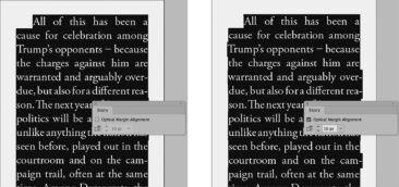
Another tip: InDesign has a feature which lets you “hang” hyphens, full points, commas, etc out to the right or left – just a little, making the edge of the column look more even – in other words: properly justified. The second column shows the result of that tweak.
As Mies van der Rohe said: God is in the details. It’s the little things that make a difference, especially in typography. It doesn’t take much extra effort, just a little attention, and will please the reader. ★