#36 Gutenberg-Preis 2026

Erik Spiekermann erhält den Gutenberg-Preis der Stadt Mainz
(English version below)
(K)eine Laudatio
Sehr geehrter Herr Oberbürgermeister, lieber Herr Haase, liebe Gäste aus Mainz und der Welt, lieber Erik, liebe Susanna, liebes Publikum, als ich gefragt wurde, ob ich mir vorstellen kann, Erik Spiekermann zu laudatieren,sagte ich sofort „ja“, schließlich wünsche ich ihn mir schon lange als Gutenbergpreisträger der Stadt Mainz. Als ich dann anfing, Ideen zu sammeln, merkte ich:
Erik ist so ganz und gar nicht der Typ für die wohlfeile Aneinanderreihung seiner Verdienste und Leistungen – obwohl es die zuhauf gibt. Erik ist ein Macher, ein Arbeiter, ja, fast ein Getriebener – und ganz und gar nicht der Typ „honoratioriger Geehrter“. Diese Preise haben ja immer etwas Lebenswerk-krönendes, damit aber auch etwas von Abgesang. Und dafür ist Erik Spiekermann viel zu agil und viel zu sehr mittendrin: Mittendrin in seinem Drucksaal. In seinem Leben voller Energie, immer offen für alles Neue. Und deshalb gibt es keine Laudatio, sondern eine Lektion:
Lernen von Erik.
Was habe ich von ihm gelernt und was können wir alle von ihm lernen? Und das ist ganz schön viel.„Don’t work for assholes, don’t work with assholes“– eines seiner ikonischen Plakate und die erste Lektion. Erik selbst hat die hart gelernt. „Better done than perfect.“„Use your fucking brain!“ Alles Botschaften auf Blei- oder Holzsatz-Plakaten, die in seiner Werkstatt entstehen und in Agenturräumen und Coworking Spaces hängen, wo immer ich hinkomme.
Lernen von Erik.
Weil wir jetzt ins Deutsche wechseln, ein Hinweis: Erik redet nur mit Menschen, die er mag. Und wen er mag, den duzt er, also verwende auch ich jetzt das Du.
Lernen von Erik:
Hinterfrage alles! Nicht destruktiv, sondern aus Neugier. Glaube nicht, was Autoritäten sagen. Glaube überhaupt nicht, dass etwas einfach so ist. Bau es auseinander. Setz es wieder zusammen. Verstehe Hintergründe. Erkunde Phänomene. Nutze die Kraft der Analogie. Geh auf die Metaebene! Sei unbequem. Sammele nie nur Wissen, suche Antworten auf Fragen. Hinterfrage diese Antworten.
Erik selbst denkt schon immer so. Spätestens in Zeiten von KI sollten wir alle das von ihm lernen. Wenn du Fahrräder liebst, beginne, sie zu sammeln, Mach dich auf die Suche nach dem besten Fahrrad der Welt. Und wenn du es nicht findest, bau es selbst! Mach dasselbe mit Uhren und Seilzügen an Bücherregalen. Mit Münzen oder Flaggen.„Das habe ich noch nie gemacht“ nimm es als Aufforderung, nicht als Ausrede! Wenn sechs Fahrräder auf einem einzigen Straßenparkplatz für Autos vor deiner Agentur abgestellt werden können, dann stell einen Fahrradständer hin! Wenn die Regler des ruhenden Verkehrs deinen Fahrradständer abbauen wollen, schraub ihn fester an. Verkehrswende kann so einfach sein. Wenn du wegziehst in andere Agenturräume und der Fahrradständer lässt sich nicht mehr abschrauben, weil ja schließlich du ihn so fest verankert hast, lass ihn da – andere freuen sich. Es geht nie nur um dein Fahrrad.
Erik war sicher kein „einfacher“ Schüler. Wahrscheinlich war er nie und nirgends „einfach“. Erik ist kein Bildungskarrierentyp. Ihm geht es nicht um den Abschluss, sondern um den Anschluss. Den Anschluss an Menschen und Phänomene. Es geht ihm auch immer um den anschließenden Schritt – und der darf gerne in eine neue Richtung führen. Erik will alles verstehen, alles und jetzt sofort. Er fragt viel, er versteht schnell – und dann macht er! Arbeitet schon als Schüler in einer Druckerei. Wünscht sich zum Geburtstag Bleisatz. Taucht tief und tiefer ein in das System Typografie. Bis er die Grundsätze versteht. Beherrscht. Und die Typografie-Szene prägt. Dann kündigt ein genialer Amerikaner einen neuen Computer an und Erik ahnt, dass hier gerade eine Revolution vor der Tür steht: Desktop Publishing. Wenn ihn dauernd Gestalter bitten, von irgendwo nach irgendwo Schriften mitzubringen, zieht er Schlüsse daraus: Digitale Schriften werden nicht mehr mit Satzmaschinen verkauft werden. Es wird einen freien Markt für Fonts geben. Wenn das in der Luft liegt, gründe einen Schriftenvertrieb!
Mach alles anders als die anderen. Behandele Fonts wie gestaltete Kulturprodukte. Setz’ radikale Gestaltung ein – und hoch professionelle Vertriebsstrukturen. Mach’ digitale Typografie massentauglich! Definiere den Markt für Schriften neu!
Wenn Gutenberg den Lettern das Laufen beigebracht hat, dann lehrte Erik sie das Fliegen.
Als digitaler Vordenker inszeniert er das klassische Schriftmusterbuch neu. Beauftragt die Crème de la Crème der Kreativszene der Neunziger: die Inszenierung digitaler Fonts in analogen Sammlerstücken. Während andere rein technisch Fonts verkaufen, inszeniert FontShop Typografie kulturell – und bald ist das FontBook dicker als die Kataloge von Quelle, Otto und Neckermann. Daneben kuratiert FontShop eine hauseigene Schriften-Bibliothek: FontFont. Macht Schriftentwerfer zu Stars und Schrift zu einem gesellschaftlichen Thema! Wenn Schrift aus der Nische heraustritt dann schaffe eine Bühne! Erfinde die Type-Conference Typo Berlin. Erik – selbst eher der analytisch-konstruktive Entwerfer von Systemen – versammelte um sich die Kreativstars einer Ära, er machte sie groß – und damit die Grafikdesignszene sichtbar.
Hätte er die Typo Berlin auf den 24. Dezember gelegt, es hätte keine und keinen von uns davon abgehalten, ins Haus der Kulturen der Welt zu kommen!
Überhaupt waren die Begegnungen am Rande der Typo die schönsten „Familienfeste“ ever. Für Erik flogen die Topkreativen um die halbe Welt –und die Welt des Grafikdesign profitierte davon! Freundschaften aufbauen und pflegen – auch das kann man von Erik lernen. Er kann andere groß sein lassen. Kann Menschen machen lassen, wachsen lassen durch Vertrauen! Und dann wachsen sie. Und wachsen ihm ans Herz. Etliche sind heute nur für ihn nach Mainz gekommen.
Wenn in England ein anderer Agenturtypus gedeiht, große Agenturen für große Jobs in großen Unternehmen – eine Professionalisierung des Designs, dann überträgt Erik das – und gründet in Deutschland.
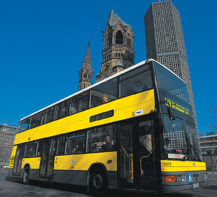
Weil seine Beobachtung richtig ist, weil seine Begeisterung ansteckt und weil er einen Riecher für gute Leute hat und die findet und einbindet, wird MetaDesign schnell groß und größer – und Grafikdesign wird gesellschaftlich sichtbar. Eine Zeit lang hat jeder, wirklich jeder Kreative, den ich kennenlernte, mit Erik für die Berliner Verkehrsbetriebe gearbeitet – gelb war neben feuerwehrrot die zweite Erik-Farbe. FontShop und BVG – alles muss man gelber machen.
Bei MetaDesign lernen, das war damals die „Hohe Schule“ und wir in der Szene beobachteten, was wir „Metastasen“ nannten: unendlich viele Neugründungen, inspiriert und angefixt von Erik – und ihm immer verbunden bleibend. Aber – und auch das kann oder muss man von ihm lernen – Begeisterung kann den Blick verengen. Machenwollen und Ärmel hochkrempeln, Entrepreneurship und vielleicht auch die Annahme, dass andere die eigene Begeisterung immer teilen – das kann dazu führen, dass man sich in Menschen täuscht. Jeder Gutenberg hat seinen Fust. Denjenigen, der denkt, es wäre doch nun wirklich wichtiger, Geld zu verdienen, als neue Ligaturen zu gießen oder Verbindungen draußen zu knüpfen.
Und plötzlich ist die „Werkstatt“ weg. Lernen von Erik heißt in dieser Phase, mit Enttäuschungen umgehen lernen. Wieder mal neu anzufangen. Nie aus dem „Machen-Modus“ rauszugehen. Lernen von Erik heißt aber auch: Wer nicht brennt für das, was er oder sie bewegen will, also für den Inhalt der Unternehmung … wer das, was er oder sie tut, vor allem unter den Gesichtspunkten der Skalierbarkeit, Effizienz und der finanziellen Trag- und Ertragskraft sieht, wird nie eine Strahlkraft aufbauen, die von innen leuchtet. Und so ging mit Erik der Glanz von Meta.
Das Ende einer Ära war auch der Verkauf von FontShop. Monotype hielt nach der Übernahme die sich durchaus selbst tragende Typo-Konferenz für weniger wichtig – und die Branche verlor ihren Herzschrittmacher. Den Rhythmusgeber des Jahres, den Leuchtturm. So was ist dann weg – und gar nicht leicht, wiederaufzubauen.
Aber wir wollen ja weiter von Erik lernen: Wenn deine Druckerei abbrennt, wenn Wasser im Keller oder ein Einbruch in die Agenturräume dir vermeintlich alles nehmen, erkenne: das können solche Ereignisse gar nicht! Du bist du – fang woanders neu an. Egal, was passiert: fang neu an!
Von Erik lernen hieß für mich vor mehr als dreißig Jahren ihm beim Zurichten einer Schrift über die Schulter schauen dürfen. Und weil ich keine Ahnung von Typografie, dafür aber ein ganz gutes Architekturdiplom hatte, übersetzte er mir Typografie in Analogien aus der Architektur – der Funke sprang nachhaltig über – die Architektin wurde Typografie-Verlegerin!
Es wundert mich nicht, dass Erik seinerseits irgendwann sein Traumhaus entworfen und gebaut hat. Und wenn Erik sich eine neue Disziplin erschließt, geht er den Dingen auf den Grund. Er ackert sich so lange durch die Bauordnung Berlins, bis er einen Weg findet, sie für seine Planung und sich zu nutzen. Er jongliert mit Geschosshöhen und Halbgeschossen, bis das vom Amt zu Verunmöglichende eben möglich – und genehmigt! – wird. Ein schmales Townhouse, viel Glas, klare Linien, Mut zu langen, schmalen Räumen, kühlen Materialien, viel Licht – Erik Spiekermann hätte sich auch als Architekt einen Spitzenplatz erobert. Auch das kann man von ihm lernen: Erschließe dir immer wieder neue Welten, stelle dich neuen Herausforderungen, wenn du klar denken kannst, kannst du alles lernen!
Das Haus ist übrigens zu verkaufen.
Von Erik lernen, heißt in Bewegung bleiben: rein körperlich mit Yoga und Radfahren, mental mit Offenheit für Neues. So lud sich vor Jahrzehnten der Digitalpionier Erik Spiekermann, derjenige, der später den ersten Mac in Deutschland orderte, für eine lange Reise so viel Musik auf seinen Computer, dass es bis nach Südfrankreich keine Wiederholung gab. Lange bevor der iPod uns unendlich Musik auf die Ohren gab …
Und was macht der Pionier des Digitalen heute? Im weißen Kittel steht er in seiner analogen Letterpress-Werkstatt p98a und druckt. Hacking Gutenberg! Er kombiniert Holz- und Bleisatz und druckt Plakate und Bücher. Schöne Bücher. Haptische Bücher. Er verlegt wertige Sammlerstücke in einer Welt, die durch Konsumwahn und Plattformen wie Amazon oder Temu ebenso verseucht wird wie durch die unreflektierte Nutzung von KI. Da schließt sich der Kreis.
Von Erik lernen, heißt: alles offen beobachten. Dann das Denken nicht vergessen. Und Stellung beziehen,auch, wenn das unbequem ist. Und dann machen.In diesem Fall eben schöne Bücher. Bücher, die es wert sind, im Neubau des Gutenbergmuseums gesammelt und gezeigt zu werden. Und nicht nur dort: Gönn dir eine Sammlung guter Bücher – auch das kann man von Erik lernen. Nicht als bildungsbürgerliches Statussymbol, sondern weil das Lesen von Texten dem Denken eine andere Art Nahrung gibt als Scrollen, Swipen und Snippets das je können.
Mit jeder Serverfarm, die kalifornische Tech-Milliardäre zur weiteren Enteignung von kreativen Urhebern und zur weiteren Unterwanderung des eigenen Denkens bauen, wächst der Wert des Buches, an dessen Inhalt und Form Menschen miteinander gearbeitet, geschliffen, gestaltet und verarbeitet haben: das Erbe Gutenbergs!
Ich gratuliere dem Gutenbergpreisträger 2026, ich gratuliere Erik Spiekermann von ganzem Herzen!
Karin Schmidt-Friderichs
Karin hat mir erlaubt, diese Nicht-Laudatio zu veröffentlichen.
***
Erik Spiekermann received the Gutenberg Prize
from the City of Mainz
(No) laudatory speech
Dear Mayor, dear Mr Haase, distinguished guests from Mainz and around the world, dear Erik, dear Susanna, ladies and gentlemen, when I was asked whether I could envisage delivering a laudatory speech for Erik Spiekermann, I immediately said “yes”; after all, I have long wanted him to be the Gutenberg Prize laureate. When I then began to gather ideas, I realised: Erik is absolutely not the sort of person for a trite listing of his merits and achievements – even though there are plenty of them. Erik is a doer, a hard worker, yes, almost a man driven by a higher purpose – and quite not the type to be a ‘distinguished honouree’. These awards always have something of a crowning achievement about them, but also something of a swan song. And Erik Spiekermann is far too agile for that, and far too much in the thick of things: right in the thick of things in his print shop. In his life full of energy, always open to anything new. And that’s why there’s no laudatory speech, but a lesson:
Learning from Erik.
What have I learnt from him, and what can we all learn from him? And that’s quite a lot. “Don’t work for assholes, don’t work with assholes” – one of his iconic posters and the first lesson. Erik himself learnt that the hard way. “Better done than perfect.” “Use your fucking brain!” All messages set in lead- or wood-type on posters created in his workshop and hanging in agency offices and co-working spaces, wherever I go.
Learning from Erik.
(This speech was, of course, written and delivered in German, so these remarks don’t mean much for non-German speaker)\ As we’re now switching to German, a quick note: Erik only speaks to people he likes. And he uses the informal ‘du’ with those he likes, so I’ll use ‘du’ too from now on.
Learning from Erik:
Question everything! Not destructively, but out of curiosity. Don’t believe what authorities say. Don’t assume anything is simply the way it is. Take it apart. Put it back together. Understand the background. Explore phenomena. Use the power of analogy. Go to the meta-level! Be a thorn in people’s side. Never just collect knowledge; seek answers to questions. Question those answers.
Erik himself has always thought this way. Especially in the age of AI, we should all learn this from him. If you love bicycles, start collecting them; set out in search of the best bicycle in the world. And if you can’t find it, build it yourself! Do the same with clocks and cable-pulls on bookshelves. With coins or flags. “I’ve never done that before” – take it as a challenge, not an excuse! If six bikes can be parked in a single on-street car parking space in front of your agency, then put up a bike rack! If the parking enforcement officers want to remove your bike rack, bolt it down even tighter. A transport revolution can be that simple. If you move to new agency premises and the bike rack can no longer be unscrewed – because, after all, you’ve anchored it so firmly – leave it there; others will be glad of it. It’s never just about your bike.
Erik was certainly no ‘easy’ pupil. In all likelihood, he was never ‘easy’ anywhere. Erik isn’t the type to chase an academic career. He’s not interested in the qualification itself, but in making connections – with people and phenomena. He’s always focused on the next step – and that’s fine if it leads in a new direction. Erik wants to understand everything, absolutely everything, and right now. He asks lots of questions, he picks things up quickly – and then he gets on with it! Even as a schoolboy, he was already working in a print shop. For his birthday, he asks for lead-type. He delves deeper and deeper into the world of typography until he understands the principles. Masters them. And leaves his mark on the typography scene. Then a brilliant American announces a new computer, and Erik senses that a revolution is just around the corner: desktop publishing. When designers are constantly asking him to bring digital fonts from the USA to Europe, he draws his own conclusions: digital fonts will no longer be sold along typesetting equipment. There will be a free market for fonts. If that’s in the air, set up a font distribution company!
Do everything differently from the others. Treat fonts like designed cultural products. Employ radical design – and highly professional distribution structures. Make digital typography accessible to the masses! Redefine the market for typefaces! If Gutenberg taught letters to walk, then Erik taught them to fly.
As a digital visionary, he reimagines the classic type specimen book. Commission the crème de la crème of the nineties’ creative scene: the staging of digital fonts as analogue collector’s items. Whilst others sell fonts on a purely technical basis, FontShop stages typography as a cultural phenomenon – and soon the FontBook is thicker than the catalogues of Quelle, Otto and Neckermann. (German mail-order companies) Alongside this, FontShop curated its own typeface library: FontFont. It turned typedesigners into stars and type into a topic of social interest! When type emerged from its niche, it created a stage for it! They invented the Type Conference Typo Berlin. Erik – himself more of an analytical, constructive designer of systems – gathered around him the creativestars of an era; he made them look good – and in doing so, brought the graphic design scene to the fore.
Had he scheduled Typo Berlin for 24 December, it wouldn’t have stopped any of us from coming to the Haus der Kulturen der Welt! In fact, the get-togethers on the fringes of Typo were the best ‘family gatherings’ ever. For Erik’s sake, the top creatives flew halfway round the world – and the world of graphic design benefited from it! Building and nurturing friendships – that’s another thing you can learn from Erik. He knows how to let others shine. He knows how to let people do their own thing, to let them grow through trust! And then they do grow. And they grow dear to his heart. Quite a few have come to Mainz today just for him.
When a different type of agency flourishes in Britain – large agencies for big jobs in large companies – a professionalisation of design – Erik takes that concept and establishes it in Germany. Because his observation is spot on, because his enthusiasm is infectious, and because he has a nose for good people and finds and brings them on board, MetaDesign quickly grows and grows – and graphic design becomes visible to society. For a while, every single creative person I met had worked with Erik for the Berliner Verkehrsbetriebe – yellow was, alongside fire-engine red, Erik’s second colour. FontShop and BVG – everything had to be made more yellow.
Learning at MetaDesign was the ‘highest form of education’ back then, and we in the scene observed what we called ‘metastases’: an endless stream of start-ups, inspired and hooked by Erik – and always remaining connected to him. But – and this, too, is something one can or must learn from him – enthusiasm can narrow one’s perspective. The drive to get things done and roll up one’s sleeves, entrepreneurship, and perhaps also the assumption that others always share one’s own enthusiasm – this can lead to misjudging people. Every Gutenberg has his Fust. The one who thinks it really is more important to make money than to cast new ligatures or forge connections out there.
And suddenly the ‘workshop’ is gone. Learning from Erik at this stage means learning to deal with disappointment. Starting afresh yet again. Never stepping out of ‘doer mode’. But learning from Erik also means: anyone who isn’t passionate about what they want to achieve – that is, about the substance of the venture … anyone who views what they do primarily through the lenses of scalability, efficiency and financial viability and profitability will never develop a charisma that shines from within. And so, with Erik, the lustre of Meta faded.
The sale of FontShop also marked the end of an era. Following the takeover, Monotype deemed the entirely self-sustaining Typo conference to be of lesser importance – and the industry lost its pacemaker. The rhythm-setter of the year, the beacon. Once something like that is gone, it’s not at all easy to rebuild.
But we want to continue learning from Erik: if your print shop burns down, if water floods the cellar or a break-in at the agency’s premises seems to take everything away from you, realise this: such events simply cannot do that! You are you – start afresh somewhere else. No matter what happens: start afresh!
For me, learning from Erik more than thirty years ago meant being allowed to look over his shoulder as he refined a typeface. And because I knew nothing about typography, but did have a very good architecture degree, he explained typography to me using analogies from architecture – the spark really caught on – and the architect became a typography publisher!
It doesn’t surprise me that Erik, for his part, eventually designed and built his dream house. And whenever Erik ventures into a new discipline, he gets to the bottom of things. He ploughs through Berlin’s building regulations until he finds a way to use them to his advantage in his planning. He juggles floor heights and mezzanines until what the authorities would normally deem impossible becomes possible – and approved! – A narrow townhouse, lots of glass, clean lines, the courage to create long, narrow rooms, cool materials, plenty of light – Erik Spiekermann would also have carved out a leading position for himself as an architect. That’s another thing you can learn from him: keep exploring new worlds, take on new challenges; if you can think clearly, you can learn anything!
Incidentally, the house is for sale.
Learning from Erik means keeping active: physically through yoga and cycling, mentally through an openness to new things. Decades ago, for instance, digital pioneer Erik Spiekermann – the man who later ordered the first Mac in Germany – loaded so much music onto his computer for a long journey that there were no repeats all the way to the south of France. Long before the iPod brought us an endless supply of music …
And what is this digital pioneer up to these days? Wearing a white lab coat, he stands in his analogue letterpress workshop, p98a, and prints. Hacking Gutenberg! He combines wood and lead type to print posters and books. Beautiful books. Tactile books. He publishes high-quality collector’s items in a world that is just as plagued by consumerism and platforms like Amazon or Temu as it is by the thoughtless use of AI. That brings us full circle.
Learning from Erik means: observing everything with an open mind. Then not forgetting to think. And taking a stand, even when it’s uncomfortable. And then taking action. In this case, beautiful books. Books that are worthy of being collected and displayed in the new building of the Gutenberg Museum. And not just there: treat yourself to a collection of good books – that, too, is something you can learn from Erik. Not as an educated middle-class’ status symbol, but because reading texts nourishes the mind in a different way than scrolling, swiping and snippets ever could. With every server farm that Californian tech billionaires build to further dispossess creative authors and to further undermine our own thinking, the value of the book grows – a book whose content and form people have collaborated on, refined, designed and crafted together: Gutenberg’s legacy!
I congratulate the winner of the 2026 Gutenberg Prize, I congratulate Erik Spiekermann with all my heart!
Karin Schmidt-Friderichs
Karin allowed me to publish her (No) laudatory speech. ★