#19 A good User Interface
Raising a red flag sends a clear message. ⬆︎
In an age where everything has to have an app and is only accessible by swiping on a piece of glass, it may be useful to remember that certain things have worked quite well and could offer clues to UI and UX designers everywhere.
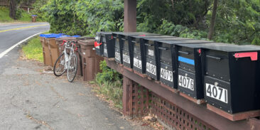
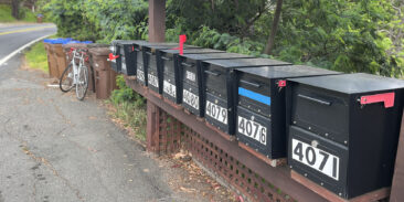
Outside of cities, you still see those mail boxes along US roads. Every address has its own box, with the house numbers clearly marked on them.
When the post-person has dropped something into one of the boxes, he/she simply raises the little red flag and the recipients know they have mail. They take it out of the box and lower the flag again. If no red flag is raised (sic!), they don’t even have to get out of the car and can continue to their houses.
I’m expecting an app that the post person will have to use to activate a digital flag, and then the recipient has to get his/her phone out to check the app to see whether there’s mail in the box by the roadside. The interface will probably show an icon of a mail box with a little red flag on its side. The physical world reduced to a comic. And it’ll be hailed as progress.