#21 Typography: History and Technology

Chauvet’s cave, Vallon-Pont-d’Arc

Before the invention of writing, men lived in an acoustic world, left to their dark thoughts.
Mankind was only freed from its ignorance with the invention of writing.

The goose quill meant that speaking had an end, as Marshall McLuhan put it. Mystery was abolished, now there were buildings and cities, streets and armies, bureaucracy. Civilization began, the step from the darkness of prehistory into the light of consciousness.

The invention of movable type was the next major leap in the development. What up until then an individual could only write once, or at best chisel in stone, was now applicable anywhere and everywhere. The separation of action and function was the condition for most of the developments of the modern age; individualism, democracy, protestantism, capitalism, and nationalism. The technology of printing and typesetting has fundamentally altered our habits of perception. 

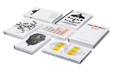
The general term typography refers to the functions of typeface design and the arrangement of type and other elements on a page. This page can also be a computer screen or the wall of a building. Up until the introduction of mechanized typesetting, compositors were the only typographers: they were also responsible for designing the pages.

The history of typography is both a history of technology and of culture. Each technical development left its trace in design and in the typographic layout. The classification of typefaces employs the same descriptions as the ones we use for stylistic periods in architecture. 

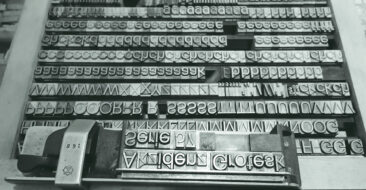
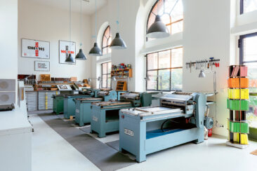
Printing using movable characters originated in China in the early 11th century. The characters were made of clay, and thus not particularly durable. 200 years later in Korea entire pages were cut in wood or cast in metal. Although this meant type was reproducible, each page could only be used once. It was the goldsmith Johannes Gutenberg (ca. 1398 – 1468) who first had the idea of cutting single letters as steel punches. These were stamped into metal to make moulds, which, in turn, were filled with a soft metal. Working in Mainz, around 1450, Gutenberg also developed the tools for type founding, which remained in use almost unchanged until the mid 19th century, and the first printing press. It consisted of a screw press, like those used to press grapes. The thin liquid inks which had been used to print wooden panels weren’t right for printing lead characters. Gutenberg had to invent an emulsion using linseed oil and soot which was sufficiently thick and dried quickly. Each sheet of paper had to be inserted and removed by hand. It wasn’t until 1814 that the Times became the first newspaper in the world to be printed on a steam-powered press made by the German mechanics Koenig & Bauer, allowing the production of up to 1100 copies per hour. Twenty years later the industrial manufacture of type using casting machines would also become a practical reality, culminating in the introduction of the Linotype machine in 1886, invented by Ottmar Mergenthaler (1854 – 1899). This machine produced lines of type (!) for newspapers and book publishers. It survived in various forms into the 1970s, when it was replaced by photosetting machines. 

Gutenberg’s first printed bible was an attempt at imitating the contemporary style of handwriting without making the mechanical origin of the print obvious. He cut several hundred ligatures that made it possible to set each line at the same width so that the reading flow would not be interrupted by varied word spacing. The type used in the Gutenberg bible was the narrow, steep Gothic script. In Germany tall, narrow Gothic arches were being built, whose shapes were reflected in type. However, in Italy the shapes of the Renaissance were already predominant. 

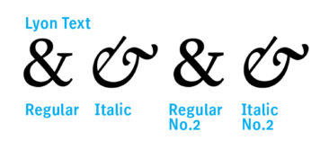
The punchcutters in Italy of the late 15th fifteenth century, such as Nicolas Jenson (1420 – 1480) or Aldus Manutius (1449 – 1515), based the design of their lowercase characters on the cursive humanistic minuscule. Due to their geographic and historical origin they’re classified as Venetian Renaissance Antiqua. Like it still is to this day, the uppercase was modelled on the unrivalled Roman Capitalis, as represented on the Trajan column in Rome. Named after a cardinal, Bembo (ca. 1495) by Aldus Manutius and his punch­cutter Francesco Griffo (1449 – 1518) marks the end of the development and is the prototype for Renaissance Antiqua of Italian origin. It took several centuries for the cursive forms to be integrated into complete type families. To this day they are known in English as Italics.

The most famous representative of the French Renaissance Antiqua was the Parisian punchcutter Claude Garamond (1499 – 1561). He and his contemporary Robert Granjon (1513 – 1589) are the originators of the typefaces described as Garamonds which became the most common book faces around 1600, which they remain today.

At the beginning of the seventeenth 17th century the Netherlands became the centre for type founding. The types at the height of the Baroque period are more casual, more robust and therefore more functional than the Renaissance typefaces. Towards the end of the 17th century punchcutters were becoming increasingly influenced by the shapes of contemporary copper engravings. The contrast between stem and hairline became more pronounced, letters looked more clinical, their shapes more precise. The punchcutters’ work was deeply influenced by Cartesian thinking and improved tools for punchcutting and type founding, in addition to higher quality paper available for setting, thanks to superior printing machines. The typefaces of William Caslon (1692 – 1766) re­present the peak of this development. His designs may not be particularly innovative or original but so pragmatically British that they soon spread successfully. Britain’s expansion as a colonial power certainly helped the matter, leading to the very Declaration of Independence of the United States of America actually being set in Caslon. The end of this period is marked by John Baskerville (1706 – 1775), a skilled tombstone engraver in Birmingham who greatly influenced the classical typeface designers with his type, rich in contrast and itself influenced by copper engraving. 

Classicism in typography, as in architecture, was never very inclined toward luxurious adornment. The ideals of the Enlightenment also required clarity and generosity of typography. Symmetry and reduction were the overriding principles of design. Thanks to the ability to print larger forms with higher precision, books became bigger (the first all-iron Stanhope press was built in 1800). Technology allowed serifs to be designed very delicately and express a lot of detail in the characters. Constructing letters with compass and ruler may have led to the desired ideal shapes, but the typefaces were actually harder to read than their Renaissance and Baroque predecessors.

Giovanni Battista (‘Giambattista’) Bodoni (1740 – 1813) was called the King of Printers and Printer of Kings. Bodoni devised and cut 270 different alphabets, for which he had to engrave some 55.000 steel punches by hand. Critics have described Bodoni’s typefaces as the expression of feudalism, even though most of them were created long after the French Revolution. He stayed away from politics, although his books were kept in Napoleon Bonaparte’s own private library. There was, however, criticism of Bodoni’s typefaces at the time – particularly in France where he had competitors who deemed themselves sole re­presentatives of classicism in typography. The English artist, draughtsman, type designer and woodcutter William Morris complained about the coldness and poor legibility of the typefaces from Parma. Bodoni himself, as far as his typefaces were concerned, was not especially inclined towards any theories. He created what he considered to be beautiful and useful. His typography is determined by the maxim A book becomes exemplary when the purity of the simple beauty of the type is most effective”.

The beginning of the industrial revolution in the early 19th nineteenth century led to different production requirements, and with that came an overproduction of goods. Typefaces from previous centuries were neither technically nor formally suitable for the large-format printing of product and services advertisements. Now headlines had to scream and mercilessly use up what little space there was. Fast steam-powered printing machines like the press for the Times (1814) enabled large editions to be printed quickly, but weren’t too gentle on the printed material. The platen presses in particular, first introduced by Isaak Adam in Boston in 1830, really damaged the fine lines of classicist typefaces.

Nonexistent serifs can’t break off, while bold serifs withstand printing better. Sans serif typefaces also take up less space while slab serif letters appear loud and impressive. The first sans serif typeface appeared in 1816 in a catalogue from the Caslon type foundry called Egyptian of all things. We actually use that term to describe slab serif typefaces, while Figgins still called a serif an Antique. The term Egyptian reflects the fashion of the time, as there had been a craze for all things Egyptian in England only a few years previously. In the Treaty of Amiens of 1802 Napoleon ceded Egypt to the British, who promptly sent the first pieces of booty from the Nile to London. Like every other fashion, it soon influenced the output of the type foundries. 

Typography soon changed to fit the new advertisement typefaces. Simple pure beauty, as Bodoni had stipulated a few years before, was no longer in demand. Loudness, size, and variety were instead the order of the day. White space became expensive, sheets had to be crammed full of print up to the edges. Newspapers had narrow columns in order to squeeze many different topics onto one page, so narrower, more robust typefaces were cut for that purpose. Technology kept up with the increasingly diverse contents of printed material. Around 1829 Firmin Didot in Paris introduced the stereotype, a process of producing letterpress plates by making a mould of a complete page and then casting it in an alloy. The use of several casts made larger print runs possible and meant less wear for the original fonts. In 1838 Moritz Hermann von Jacobi invented galvanizing, with which artwork such as woodcuts could be lifted” and then copied to make a durable block. Typographers now had to integrate illustrations into their pages because text and image were easily printable in one forme. The invention of the process block in 1840 made it possible to insert handwritten typefaces or company logos into the page for printing. Around the end of the century, the invention of the halftone screen by Meisenbach meant that photographs could also be reproduced.

Typography toward the end of the 19th century could graciously be called eclectic. Everything was technically possible, so everything that could be done was done. The Arts & Crafts movement arose in England as a reaction to the historicism of the Victorian era and the machine-made products of the Industrial Revolution. William Morris (18341896) founded the Kelmscott Press in Hammersmith near London in 1891 in order to produce high quality books. He designed some typefaces of his own because he found all of the existing ones too cold and insipid (see Bodoni). His Golden Type was inspired by the early Venetian printer Nicolas Jenson. The ornamentation followed mediaeval woodcuts. The handmade approach to materials and the simplicity of form influenced movements such as Art Nouveau, the Vienna Secession, the Deutscher Werkbund, and even Bauhaus. A new kind of book art also developed in Germany. Fritz Helmut Ehmcke (18781965) and Friedrich Wilhelm Kleukens (1878 – 1956) were young type designers before the First World War. They rejected both the ornate style of Art Nouveau and the late classicism that was equally prevalent at the time. Their idea of a modern, tidy typographic design was more akin to the ideal of the Renaissance. This outlook was shared by the most important teachers of type and typography, who were at the same time typeface designers. Walter Tiemann (1876 – 1951) taught at Leipzig, F. H. Schneidler (1882 – 1956) at Stuttgart, and Rudolf Koch (1876 – 1934) at Offenbach. Their ideas remained significant until after the Second World War. 

Manufacturing techniques around this time determined both the design and production of type. Just one year after the Linotype, the Lanston Monotype hit the market, invented by Tolbert Lanston. It cast single letters and was operated by a keyboard. Typographic design was thus subject to the changing parameters of typesetting machines. New typefaces had to be designed that could match the technical requirements of the new machines as well as the prevailing fashions, which changed ever more regularly due to the increasingly shorter period between the design and production of type. The pantograph enabled engraved designs of any size to be duplicated from a draft, even if some aesthetic compromises had to be made. In the USA William Leavenworth constructed the first cutter for wooden type characters in 1834 to meet the huge demand for large wooden poster fonts used for billboards. 

The first machine for engraving steel punches was patented by Lynn Boyd Benton (1844 – 1932) in 1885, just at the right time to develop the typefaces the market demanded. Monotype and Linotype were responsible for many reissues of classic typefaces which later served as drafts for the phototypesetting of the 1960s and the first generation of digital typesetting machines in the 80s. Times New Roman, the most famous of all Antiquas, was designed by Stanley Morison (1889 – 1967) and Victor Lardent in 1932 at Monotype in England. It was based on Plantin, which F. H. Pierpont had already designed in 1913, also for Monotype, and which in turn drew on Dutch Baroque typefaces of the 17th seven­teenth Century.

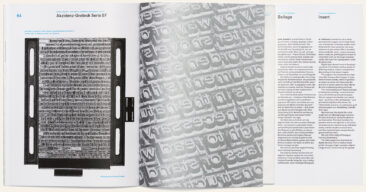
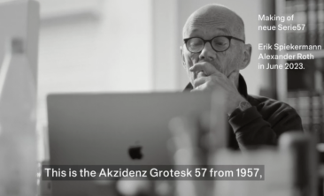
There was a new form of type being used at the start of the 20th twentieth Century, although it still played a minor role. To get a taste of how unusual and alien this new type seemed at the time, we need only note the description Grotesk”, given to these typefaces on their first appearance at the start of the Industrial Revolution in the early 19th nineteenth Century. In the USA the sans serif typefaces were deemed equally strange, earning them the name Gothic”. In Germany, Akzidenz Grotesk, first released in a single weight in Berlin in 1896, is regarded as the mother of its genre. Its roots are fairly obscure, but one of its siblings was Royal Grotesk, made in the 1880s at Ferd. Theinhardt. Meanwhile in the USA, in 1904, Morris Fuller Benton (1872 – 1948) created Franklin Gothic, which could be considered its American counterpart. Benton was responsible for many other classic typefaces including Garamond, Bodoni, Cheltenham, Century, News Gothic, Bank Gothic, Clearface, and Cloister.

Sans serif typefaces such as Akzidenz Grotesk and Franklin Gothic trace back to the classicist ideal. Univers, designed by Adrian Frutiger (1928 – 2015) and released in 1957, the first typeface to be systematically constructed and named as a family, also adheres to this model. Frutiger’s later design of a classicist Antiqua, Centennial, is therefore also a Univers with serifs. 

The sans serifs from England conform to the Renaissance model, the best known being Gill Sans by Eric Gill (1882 – 1940) from 1928, which coined the term for these typefaces in English. It was only in the 90s that there was a major reemergence of sans serif faces, which — like FF Meta by Erik Spiekermann — recall Syntax by Hans Eduard Meier (1922 – 2014), released in 1969. In the Netherlands in particular this kind of typeface design is strongly encouraged. It is closely linked to the movement of the hand when writing, thereby creating rhythm and contrast. This direction is the most common among contemporary designs. 

Sans serif typeface design can also be defined by its pure geometric forms. In the 1920s every major type foundry in Germany had such a Grotesk on offer. The most successful of these typefaces was Futura by Paul Renner (1878 – 1956), released by Bauer in 1928. Even though Futura exactly fit the kind of typeface for the modern age espoused by the Bauhaus representatives of Elementary Typography, it came out too late to be used for the school’s typesetting.

In the Twenties typography became an important discipline because it merged communication and expression. Dadaists like Kurt Schwitters didn’t set their work in cumbersome lead type, but made montages of prints, photos, and words on shreds of paper. On the other hand De Stijl in the Netherlands and Moholy-Nagy, Joost Schmidt, and Herbert Bayer of the Bauhaus used typefaces, colours and halftone images for book pages, catalogues, and posters. The artist El Lissitzky (1890 – 1941) was the Soviet cultural delegate in Weimar. There he developed his form of expression, the typophoto”, and strongly influenced the Bauhaus colleagues and De Stijl. In 1925 a young Jan Tschichold (1902 – 1974) published an essay (using the first name of Iwan) in a special edition of Typographische Mitteilungen’ (Typographic News) under the title Elementary Typography.’ This was his manifest for a New Typography“. In 1933 he emigrated to Switzerland whereupon he soon vehemently rejected the tenets of the New Typography. He returned to the traditional way, promoting the use of older Antiqua typefaces and the symmetric arrangement of page elements, which he had previously dismissed as outdated. 

After the end of the Second World War, Swiss graphic design became the prevailing trendsetter, first spreading from Zurich to Germany and then throughout the world. The search for a rational and straightforward typeface led most graphic designers to Akzidenz Grotesk, cast and sold by Berthold in Berlin. The Haas’sche type foundry in Münchenstein had its Haas Grotesk on offer, which could be traced back to Scheltersche Grotesk by Schelter & Giesecke in Leipzig. Scheltersche was the font which lay in the cases at the Bauhaus workshops and in which much of the material was set that represented the eponymous style. It nevertheless didn’t quite match the expectations of designers who were looking for a typeface free of historical ballast and which didn’t push its way to the foreground.

The success of Akzidenz Grotesk prompted Eduard Hofmann, business director at Haas, to commission his colleague Miedinger to finalise sketches for a typeface that would compete in the same market. The Haas’sche type foundry belonged to D. Stempel AG in Frankfurt, which in turn was owned by Linotype. It was Stempel who suggested they find a popular name to help sell the new typeface. As there were sewing machines and an insurance company already using the name Helvetia (Switzerland), Hoffmann suggested Helvetica, meaning Swiss”. It was released as Helvetica in 1957, the same year as Univers. That year also saw the Treaty of Rome and the Citroën DS.

The featureless typeface became world famous in the mid 60s, particularly as American businesses sought to lend themselves an air of modernity and cosmopolitanism by adopting it as their company typeface. It was no surprise then that it was an American who saw to it that Helvetica would become the standard typeface for the new tool of the graphic industry. In 1984 Steve Jobs selected the thirteen fonts to be installed on the first Apple laser printer. Among them Helvetica was the neutral, objective business font, with which one couldn’t go wrong.

The ironic thing is that most computers don’t have the original but the fake. In order to save license fees, Microsoft installed a clone in 1990 which has the same widths as Helvetica and – like all imitations – is formally inferior. But it can be found under the name Arial in all font menus and has thus become the most used system font.

The type foundries had already once reworked the classic typefaces for new typesetting systems. They had to do so again in the late 60s, when the first phototypesetting machines came on the market. The designs were no longer cut in steel and cast in lead, but drawn and transferred photographically onto carriers from which each letter was projected onto film. Seeing as the new material was not subject to any mechanical limitations, typeface designers were free from creative restrictions. Nowadays we can compare many of the 70s seventies typefaces with typography toward the end of the 19th nineteenth Century. The International Typeface Corporation ITC in New York did not only release many typefaces which reflected the spirit of advertising on Madison Avenue, they also had a new distribution model. Up until then all manufacturers of typesetting systems had their own type formats which wouldn’t work on their competitors’ machines. That gave graphic designers and typographers an incentive to favour one particular system because it exclusively offered certain fonts. At the same time it allowed many companies to prosper by either copying typefaces and selling poor imitations cheaply or altering them slightly and releasing them under different names. Now ITC delivered artwork to all manufacturers who paid license fees, and consequently these were the only fonts that were available on all machines. 

Phototypesetting systems were still so complicated to use and so dear that a whole industry of layout typesetters emerged, selling their know-how at lucrative prices. At least the device operators were still skilled typesetters who had learnt the rules and would apply a certain standard to their intermediate product. Graphic designers, on the other hand, were keen to intervene and add their mark before sending the final artwork to the printers.

Phototypesetting fonts could be made to any size and placed in any position on a page by paper- or film make-up. The right angle was no longer all-important for the layout. For the design hippies of the flower power era this was excellent news.

The end of the design process always required a piece of film from which the printing plate was exposed. For this, apart from the typesetter, a reproduction photographer was required to capture the images on film, a lithographer or finished artist to copy together type and images for each individual colour, and graphic designers to have the ideas and specify layouts.

This mode of production became outdated virtually from one day to the next in the mid 80s eighties with the invention of Adobe’s page description language PostScript by John Warnock (1940 – 2023) and Chuck Geschke (1939 – 2021). This computer language allows every point on a page to be defined and marked to within a thousandth of a millimeter. Be it image, graphic element, or type, everything is composed of tiny pixels that are transferred to paper, film or printing plate by laser beam or ink jet.

The appearance of the Apple Macintosh along with the first laser typesetter by Linotype established desktop publishing, DTP. The job description of typesetters transformed into that of digital media designer. Graphic designers today no longer merely need to have ideas and visualize them, instead they are usually also responsible for the entire page, which they hand over ready to print and which goes to the printing plate without film exposure or any other final visual manifestation involved. The end of the division of labour meant that much expertise disappeared and new generations of designers had learn the rules all over again. A phase of deconstruction ensued in the mid 90s, when all the old rules were put into question without any new ones to replace them. Like punk in the 70s, the grunge movement of the time found its typographic expression in the wild splicing together of illegible spontaneous typefaces, blurry images and overlapping areas and backgrounds. Software such as Photoshop created the conditions in which the distinction between image and type could disappear. 

Along with the liberation of page design from any kind of mechanical constraint, there’s the possibility of manipulating any of the fonts available in Postscript format. Now anyone can become a type designer, providing they can pay for one of the programs with which letters can be drawn and fonts produced.

Like in all previous phases of typographic history, after these developments it took a while for new rules to be developed (which surprisingly often turned out identical to the traditional ones) and readers and users of visual communications were put back into the focus of design activities. In the mid 80s the fonts for the new format were converted — initially by the traditional type manufacturers — without which no newspapers, magazines or books can be published. The first versions suffered from teething problems, and have since all been reworked. 

Even young type designers couldn’t get enough of the new possibilities in the beginning. Graphic designers like Neville Brody or David Carson oriented their typefaces and layouts according to the Zeitgeist, erasing the separation of image and type. They painted digitally. In The Hague in 1990 Erik van Blokland and Just van Rossum programmed the first typeface with a random generator that changed its outlines each time it was printed. Beowulf was the first random font, and its dirty edges were an antidote to the perfect but often soulless Postscript fonts. In 1986 the type designer Zuzana Licko from Berkeley used the rough pixels of early screen displays to make typefaces that merrily show off their crude outlines. She also ended up returning to the classics and designed her version of Baskerville under the name of Mrs Eaves – John Baskerville’s housekeeper. Well-established designers like Adrian Frutiger and Hermann Zapf oversaw the redigitalization of their old typefaces, while masters like Matthew Carter designed fonts for the computer screen on that medium. His Georgia is not only perfectly legible on screen but can also stand up to the classics as a proper text face. 

In 1988, Erik Spiekermann started FontShop, the first independent distributor of fonts. They offered fonts from many freelance designers as well as small digital foundries”. FontShop also curated their own label, FontFont, as type for designers by designers”. His own FF Meta heralded the arrival of a new kind of sans serif which anticipated the trends of that decade and was called the Helvetica of the 90s”.

The new distribution model enabled freelance type-designers to bring their own designs to market without the help (or interference) of large companies. Innovation now came mostly from those individuals who often had to support their typedesign activities with normal” design work. This brought the design of typefaces closer to the normal practise of communication design, increasing type’s visibility and acceptance.

Nearly all major brands now have their own typefaces. Newspapers and magazines can have special typefaces designed for them which not only reinforce their brands but may be specifically tailored to suit production requirements such as paper or printing machines, and even match the readers’ habits and expectations. 

Huge font clans with over 144 members offer every kind of possible use, even for complex printing matter. Most new text typefaces are offered with at least seven weights, a feature enabled by software for interpolating between the thinnest and the heaviest weight. Variable fonts are the latest development, giving designers more choices than most can handle.

At the start of the 21st twenty-first century better tools exist than ever for the design of printed matter and other media. The differences between traditional book typography, functional design concepts and sophisticated, colourful advertisements are no longer the guiding factor, but rather the synthesis of these varying strands. Different typefaces may be mixed, justified type exists alongside ragged type, freeform page layout alongside strict grid systems. And for headlines, packaging, flyers and other forms of disposable printed matter, websites and videos, there are more than 250,000 typefaces that are sold or given away as fonts. And if it isn’t legible, it serves to boost the creative expression of its originators.

Technical possibilities today mean that anyone with a PC and a printer can be a typographer, programmer, typesetter, designer, lithographer, print technician, editor and corrector. Business has also changed together with production. Alongside the major manufacturers such as Adobe and Monotype – which has bought up every other successful digital foundry – there are now hundreds of tiny digital foundries that often have no more than a couple of fonts and a website. Everyone is in competition with one another, but almost everyone gets along. Google Fonts is another major player, offering libre” fonts – you don’t pay a license fee, but Google gets a look at your font server data. 

Designers have great choices: there have never been such useful tools for creating good typography. Nor so few excuses for doing something badly. ★


This article needs more illustrations. Not every reader will be able to visualize every typeface, machine or person mentioned.
I’ve added that to my list …

#20 A new, old typeface

Akzidenz Grotesk Serie 57, 28pt in a case at the Hacking Gutenberg workshop in Berlin


This new typeface
is neither a revival nor a reworking of an old type. It is a discovery – or rather a rediscovery. 

Of course I had seen Akzidenz Grotesk Serie 57 in the Berthold specimens and knew that the weights from 14 point onwards looked different from the smaller text weights, which had been made available for the Linotype. But I had never thought about the design process, even though 1957 was such an important year for typography: Helvetica, Univers! 

We do know that the first publication of a hot metal typeface rarely marks the beginning nor the end of a years-long process of development, but there must have been a reason why Günter Gerhard Lange chose exactly this year to name the face. 

The design of the text sizes for machine setting was not changed, only the widths were adapted for the Linotype system. They were available as early as 1957 and could be combined with the Akzidenz Grotesk weights for handsetting. But the spirit of the times wanted more of a system: the members of the AG family had never been coordinated, they had just come together over decades. Adrian Frutiger’s Univers, on the other hand, was designed as a system: tidy, comprehensive, modern, while Neue Haas Grotesk was not yet called Helvetica but had been planned to end the dominance of AG.


Akzidenz Grotesk Serie57
A spread from a Berthold specimen book


In 1959, AG 57 sizes from 14 to 48 point were released. GGL had caught the spirit of the times and tidied up, smoothed out and simplified the youngest child of the family. Unfortunately, it was never made into a complete family of faces. Until we discovered a mis-labelled case with AG 57 in 16 and 20 point

The neue Serie57® is not a revival, but a new digital typeface. It is dedicated to Günter Gerhard Lange, my teacher and role model. 

We printed a 64-page brochure describing the development process from the first digital version to the complete family which can be ordered from Alex Roth’s website here:


Our friend Stefan Nitzsche made a short video:

#19 A good User Interface

Raising a red flag sends a clear message. ⬆︎

In an age where everything has to have an app and is only accessible by swiping on a piece of glass, it may be useful to remember that certain things have worked quite well and could offer clues to UI and UX designers everywhere.


Outside of cities, you still see those mail boxes along US roads. Every address has its own box, with the house numbers clearly marked on them.

When the post-person has dropped something into one of the boxes, he/she simply raises the little red flag and the recipients know they have mail. They take it out of the box and lower the flag again. If no red flag is raised (sic!), they don’t even have to get out of the car and can continue to their houses.


I’m expecting an app that the post person will have to use to activate a digital flag, and then the recipient has to get his/her phone out to check the app to see whether there’s mail in the box by the roadside. The interface will probably show an icon of a mail box with a little red flag on its side. The physical world reduced to a comic. And it’ll be hailed as progress.

#18 My biggest professional fuck-up

Back around 1996 / 1997, before data was available in the Cloud and all computers could easily be connected to each other, to printers, servers, and even telephones, we had persuaded the rather conservative people at VWs headquarters in Germany to let us try something new.

We had designed a new family of typefaces for them – part of the big rebranding project we had started with VW and Audi in 1994. I was in charge of the work at MetaDesign and had been bragging about the fact that we had actually hired in-house back-end programmers, which at that time was not something that other CD agencies would do. We said that we could easily write a programme to upload the new fonts onto all their in-house printers – at a time when applications and other data were being shipped on CD-Rom disks and then manually uploaded onto individual machines. While still sceptical, their IT people believed us, as long as we would provide a back-up in case of problems.

So we installed a help-line via fax, sent out the font data across the VW intranet and waited. After a few hours the first faxes arrived, pages showing typefaces such as Hobo, Cooper Black, Zapf Chancery, and other faces that definitely were not and never had been part of the VW corporate design. Comments were scathing. It didn’t take us too long to work out that we had overlooked a simple fact: in those days printers worked to the First In First Out principle. As the printers were never fully switched off, the fonts that had first been installed would override those that came later. Our new fonts had, indeed, been properly installed, but when test documents were printed, the old fonts overrode the new ones. We had forgotten to send code which would delete existing fonts and allow only the new ones to be printed.

This was embarrassing beyond belief: We were, however, saved by the fact that all those other fonts had been used to print private documents: a church newspaper, football club leaflets, and other publications which showed what VW employees did in their spare time, albeit at work and on company printers. As these activities were not part of their job descriptions, neither were the publications. We talked to the Workers Council (Betriebsrat), rather a powerful institution at VW (which is still partly state-owned), and they were as interested as we were to not make too much of a fuss about the whole thing.

We rewrote the code with a command to delete all existing fonts in every printer and uploaded the new ones again. Worked beautifully. Finally, our client in the marketing department could brag about the cool stuff their design agency had done.

Definitely the worst moment in my professional career. For a few days I honestly thought this fuck-up would be the end of it. ★

#17 Typomanie und Bushidō

Alles ist fertig, es muss nur noch gemacht werden

Andreas Pflüger und Erik Spiekermann über Typomanie, Arbeitsethos, Rhythmus und Form, den Bushidō, die Abwesenheit von Licht, Schwarzbrot und Schnapstrinken und ihre Zusammenarbeit.

Niemals von Andreas Pflüger war nach seinem Endgültig nicht nur das zweite Buch im Hauptprogramm des Suhrkamp Verlages, bei dem statt Roman“ die Bezeichnung Thriller“ auf dem Cover steht. (Siehe dazu auch Alf Mayer im Freitag: Genre is in the House“, sowie sein großes CrimeMag-Interview.) Niemals ist auch das erste Buch – und dies nicht nur bei Suhrkamp –, bei dem ein Autor und ein Gestalter, beide von Weltrang, jede einzelne Zeile, ja jedes Schriftzeichen gemeinsam bearbeitet haben. Wir freuen uns, Ihnen dieses in vielerlei Hinsicht interessante Gespräch aus dem Logbuch Suhrkamp präsentieren zu können. Möge es Folgen zeitigen …


Pflüger: Meine Mutter sagte, dass ich ein seltsames Kind war. Wenn sie mir vor dem Einschlafen aus Kinderbüchern vorgelesen hat, soll ich sie ihr bisweilen aus der Hand ge­nommen und die Qualität der Illustrationen bewertet haben. Es hätte mir nicht genügt, eine schöne Geschichte zu hören, es sei mir wichtig gewesen, dass sie ebenso dargestellt wurde. Daran erinnere ich mich nicht mehr, aber ich glaube es sofort. Bis heute kann ich kein Buch lesen, ohne das Layout zu analysieren, mich am Satz zu erfreuen oder ihn still zu zerpflücken; selbst bei der morgendlichen Zeitungslektüre ist das so. Auch Handschriften faszinieren mich. Dabei ist meine eigene krakelig und kaum zu entziffern, vermutlich hätte ich einen guten Arzt abgegeben.
Spiekermann: Ich habe mir mühsam abgewöhnen müssen, einen Text erst zu lesen, wenn ich die Schrift identifiziert hatte, aus der er gesetzt ist. Zum einen gibt es derweil zu viele Schriften, die ich nicht mehr erkenne, zum anderen hat es mir oft den Appetit verdorben, wenn er aus der unpassenden Schrift gesetzt war.
Pflüger: Das Erste, was mir bei dir immer in den Sinn kommt, ist der Schriftzug am Terminal des Düsseldorfer Flughafens. Allein die Idee, die unteren zehn Prozent des Städtenamens abzuschneiden! Du hast das, glaube ich, kurz nach dem Feuer entworfen, das dort schlimm gewütet hatte. Diese Wunde ist im Schriftzug enthalten, das ist für mich ein Geniestreich.
Spiekermann: Manchmal profitieren wir von Ereignissen, an denen wir nicht schuld sind. Das war auch nach dem Mauerfall mit der Arbeit für die Berliner Verkehrsbetriebe so. Dabei hat in solchen Fällen die Arbeit unter großem Zeitdruck den Vorteil, dass der Druck die Teams von Auftraggeber und Designer zusammenbringt. Da ist keine Zeit für Bedenkenträger, und die Ergebnisse sind entsprechend dicht.


Pflüger: Düsseldorf ist ja nur ein Beispiel. Wir sind alle von deinen Schriften und Symbolen umgeben. Die DB Informationen, die ZDF-Nachrichten, das Leitsystem der BVG, Marken wie Audi und VW und vieles mehr. Und das ist nur Deutschland. Auf subversive Weise prägt dein Design unseren Alltag.

Spiekermann: Mir gefällt es, wenn ich im Zug sitze oder in der U-Bahn und umgeben bin von den Ergebnissen unserer Arbeit. Niemand weiß, wer dahinter steckt, außer mir. Das ist so ein Rumpelstilzchen Gefühl: Es ist gut, dass niemand weiß … Es geht ja um die Sache und nicht darum, als großer Künstler in den Vordergrund zu treten.
Pflüger: Ich glaube, bei Suhrkamp waren sie vor unserem ersten Treffen ein bisschen nervös. Es war ein Experiment und nicht ausgemacht, dass wir beide eine gemeinsame Sprache finden. Ich könnte mir vorstellen, dass man befürchtete, wir würden wie zwei D‑Züge aufeinander zurasen und die Splitter würden bis in die Pappelallee fliegen. Aber ich war ganz gelassen und voller Vorfreude. Du nennst dich ja selber einen »Typomanen«. Es ist das Wort, das ich immer für mich selbst gesucht habe. Die Erfahrung hat mich gelehrt, dass Menschen, die für etwas brennen, einander achten.
Spiekermann: Deshalb hatte ich keine Angst vor dem Treffen. Menschen, die so denken wie du, verstehen, dass es Anderen auch so gehen kann, und sind bereit, sich darauf einzulassen. Eine ganz einfache Frage des Respekts.
Pflüger: Ich weiß noch, wie ich bei euch reinkam, das ist ja bei mir um die Ecke, und die vielen Kästen mit Lettern sah. Es roch nach Öl und altem Mauerwerk und hochgekrempelten Ärmeln, und eure uralte Heidelberg-Druckmaschine machte ordentlich Krach. Da werde ich zum Kind. Das Anfassen, Riechen, Hören fehlt mir am Schreibtisch; darum beneide ich dich. Ich besitze viele Blei- und Buntstifte in allen Farben und umgebe mich damit, aber nicht, weil ich sie für meine Arbeit brauche, das ist ja alles digital. Nur finde ich es einfach wunderschön.


Spiekermann: Deshalb mache ich das. Bin ja offiziell im Ruhestand. Aber nach 30 digitalen Jahren wollte ich mal wieder was in die Hand nehmen. Damit bin ich nicht alleine, sondern nur dem Trend etwas voraus.
Pflüger: Zunächst einmal mochtest du Niemals. Das war schon wichtig. Ich weiß nicht, ob wir so hätten harmonieren können, wenn du gesagt hättest: »Das Buch ist nicht mein Ding, aber da stehe ich drüber.«
Spiekermann: Mein Motto ist ja: »Arbeite nicht mit Arschlöchern und arbeite nicht für Arschlöcher.« Ich hätte mir nicht diese Mühe gemacht für einen Text, den ich doof finde. Und nicht mir dir gearbeitet, wenn ich dich doof gefunden hätte. Das Gegenteil war der Fall, und eigentlich hätten wir uns schon lange kennen müssen.
Pflüger: Es ging mir dabei gar nicht so sehr um die Anerkennung, die jeder Autor sucht und genießt. Ich muss mich mit meiner Arbeit einem Diskurs stellen, das beinhaltet immer auch Kritik. Nur bin ich der Überzeugung, dass die erzählerische Kraft eines Textes nicht allein aus der Sprache erwächst, dem, was ich die »innere Form« nenne. Nein, sie hängt auch von der »äußeren Form« ab: der Gestaltung. Rhythmus ist das Zusammenwirken des Äußeren und des Inneren. Nur wenn beides übereinkommt, ist das Werk gelungen. Und deshalb war es wichtig, dass du dich diesem Rhythmus überlassen wolltest. Übrigens widerspreche ich dem ansonsten von mir geschätzten Ferdinand de Saussure, der sagte: »Geschriebene Formen verdunkeln unsere Sicht der Sprache. Sie sind weniger ein Kleidungsstück als eine Verkleidung.« Au contraire: Nur das, was auf dem Papier steht, ist wahr. Beim Schreiben streift der Autor jede Verkleidung ab. Wenn er kein Feigling ist.
Spiekermann: Richtig. Schrift ist ja nichts anderes als sichtbare Sprache. Du kannst auch auf dem Papier lügen. Aber du wirst noch schneller dabei ertappt, als wenn die Lüge nur aus deinem Mund kommt. Gedrucktes ist immer und überall nachzuprüfen.
Pflüger: Am wunderbarsten war dein Vorschlag, dass wir uns nebeneinander setzen sollten, um Hand in Hand zu arbeiten. Da haben meine Synapsen sofort gefeuert. Und im Augenwinkel habe ich den gerahmten Spruch gesehen, der bei euch an der Wand hängt: Alles ist fertig, es muss nur noch gemacht werden.
Spiekermann: Wenn ich schon das Privileg habe, mit einem Autor zu arbeiten, der meine Arbeit so schätzt, dass er sein Manuskript pingelig vorbereitet, um es dann zur Diskussion zu stellen, dann sind wir Partner und jeder kann vom anderen lernen. Das geht doch am besten, wenn wir beide in die gleiche Richtung schauen. Wir waren ja oft nur um wenige Millimeter auseinander, und es war jedesmal ein Vergnügen zu sehen, ob deine Simulation dann auch passt, oder was wir machen müssen, um sie passend zu machen. Das ging nur im unmittelbaren Dialog. Wir haben ja sogar über stilistische Dinge gestritten, nicht nur über die Form.
Pflüger: Du hast ein natürliches Sprachgefühl, das kann man nicht lernen. Mit dir zu streiten, ist manchmal auch herrlich albern. Und was meine Manuskripte angeht: Ich habe mir dazu ein eigenes Programm in Word geschrieben. Mit Makros kann ich das Layout meiner Texte so simulieren, dass sie der Idealvorstellung des endgültigen Layouts fast zu hundert Prozent entsprechen. Damit arbeite ich auch beim Drehbuchschreiben. Man ­könn­­te einwenden, dass es überflüssig ist, weil das Drehbuch ja nicht gedruckt wird. Da bin ich anderer Meinung. Ich finde, es sollte ein Vergnügen sein, ein Drehbuch zu lesen. Bei schlecht gesetzten Drehbüchern lenkt mich die äußere Form vom Inhalt ab. Mag sein, dass das außer mir niemanden interessiert. Oft habe ich jedoch von Schauspielern, Regisseuren, Produzenten gehört, dass meine Drehbücher wohltuend »anders« aussähen. Greifen kann das selten einer, die meisten denken auch nicht darüber nach, warum sie so empfunden haben. Es ist ein schönes Beispiel dafür, wie die Gestaltung in unserem Unterbewusstsein wirkt.


Spiekermann: So eine Seite lädt mich mehr zum Lesen und Mitdenken ein als ein ungegliederter Schreibmaschinenschrieb. Es sieht nach Vergnügen aus und nicht nach Arbeit. Man klatscht einem im Restaurant ja auch nicht den Kartoffelbrei von weitem auf den Teller.
Pflüger: Wie bist du an Niemals herangegangen? Warum hast du die Schrift Lyon gewählt, die mich vom ersten Moment an angesprochen hat?


Spiekermann: Die Schrift ist eigentlich ganz normal, aber ein wenig ausdrucksstärker als die gewöhnlichen Buchschriften, die auf Modelle aus dem 16. oder 17. Jahrhundert zurückgehen. Lyon ist eine zeitgenössische Interpretation. Sie wurde lange im Magazin der New York Times verwendet und wirkt etwas schneller, gedrängter, journalistischer, als wir es von Buchschriften gewohnt sind. Deine Texte sind sehr dynamisch, intensiv und vor allem durch die vielen Dialoge geprägt. Dazu passt diese Schrift.
Pflüger: Das Schriftzeichen der Lyon, das ich am meisten liebe, ist das kursive &-Symbol. Ein Kunstwerk für sich, wunderbar altmodisch, da kann ich mich hineinfallen lassen:
Spiekermann: Ich liebe überhaupt die Kursive der Lyon. Sie ist recht schmal und kontrastreich und wirkt dadurch wie eine noch dringendere Stimme als der gewöhnlich gesetzte Text.


Pflüger: In mehreren Interviews mit dir habe ich gehört und gelesen, dass du Schrifttypen mit Brotsorten vergleichst. Schwarz- und Weißbrot. Das hat mir gefallen.
Spiekermann: Schrift soll nicht ablenken vom Inhalt. Aber ein würziger Käse wird ja nicht übertönt vom Schwarzbrot, sondern im Geschmack verstärkt.
Pflüger: Da treffen wir uns, wie so oft. Lyrik süffele ich wie einen guten Rotwein. Und Thriller sind scharf wie Schnaps, die müssen brennen.
Spiekermann: Wahrscheinlich hast du mir deshalb einen guten Schnaps zum Abschluss der Arbeit geschenkt …
Pflüger: Einen Gravensteiner Apfel von Rochelt, der einzig wahre Stoff. Wer gut arbeitet, kann auch gut Schnaps trinken, das ist immer so. Vor allem wollte ich mich bei dir bedanken, wie viel ich von dir gelernt habe. Keine Trennungen von ungeraden auf gerade Seiten (also von rechts nach links) etwa, weil man nicht mitten im Wort umblättern sollte. Oder auch, keine Namen zu trennen. Das ist mir vorher nie in den Sinn gekommen. Und jetzt wäre mir etwas anderes ein Graus.
Spiekermann: Das sind zum Teil sehr alte Regeln. Aber das Buch hat sich in seiner Form ja auch schon seit 500 Jahren kaum geändert. Ich mag Regeln, wenn sie dem Leser beim Aufnehmen und Verstehen des Textes helfen. Ein Eigenname ist kein beliebiges zusammengesetztes Hauptwort – wo will man da trennen? Nicht jeder Name ist so praktisch wie Spieker-mann. Pflü-ger geht überhaupt nicht.


Pflüger: Was mir von Anfang an gefallen hat, war die Atmosphäre bei euch, das gute Miteinander. Keiner neidet dem anderen etwas, das habe ich gleich gespürt. Man schaut sich gegenseitig über die Schulter, kommentiert den Fortschritt der Arbeit, gibt Anregungen, lacht und freut sich zusammen, wenn etwas gelungen ist. So etwas vermisse ich oft, weil ich ja als Autor ein Einzeltäter bin.
Spiekermann: Deshalb arbeite ich ja auch nicht allein zuhause (obwohl wir beide uns da auch schon zur Arbeit getroffen haben). Daheim habe ich mehr Ruhe und kann besser Ordnung halten, aber mir fehlt dann eben genau dieses Miteinander.
Pflüger: Was uns eint, ist auch die Ordnung auf unseren Schreibtischen. Ich brauche diese Ruhe, die den Blick nicht ablenkt. Du offensichtlich auch.


Spiekermann
: Ich habe drei Schreibtische. Das ist mitunter verwirrend, weil natürlich auf dem einen immer das gerade fehlt, was auf dem anderen liegengeblieben ist. Zuhause ist es recht ordentlich, weil ich dort vor allem schreibe und weiter kein Werkzeug brauche. In der Werkstatt p98a liegen auch Maschinenteile rum, einzelne Bleibuchstaben, Probeabzüge, Messgeräte und viel Gedrucktes. Dort arbeiten viele Leute, ständig kommt Besuch herein und bringt was, holt was ab. Dieses Gewusel findet auf meinem Schreibtisch sein Abbild. Ich räume immer mal auf, aber das hält nur bis zum nächste Nachmittag. In San Francisco hingegen haben Susanna und ich die Garage umgebaut zu einem sehr lichten Studio. Unser gemeinsamer Schreibtisch ist riesig und aufgeräumt, weil wir beide immer nur je ein Projekt gleichzeitig in Arbeit haben und alles andere aus dem Weg nehmen, bis wir es brauchen. Ich finde so einen leeren Tisch sehr entspannend und inspirierend, kann das aber nicht überall umsetzen.
Pflüger: Wichtig ist ja nur, was am Schreibtisch entsteht. Auch aus Chaos kann Struktur erwachsen. Wir haben jedes Detail des Buches mit Bedacht gestaltet und darauf geachtet, dass alles im Einklang ist. Keine Hurenkinder, keine Schusterjungen, das sollte eine Selbstverständlichkeit sein. Doch in den letzten Jahren hat sich diese Nachlässigkeit in die meisten Romane eingeschlichen, weil es billiger für die Verlage ist, denn der Autor muss keinen Text ändern. Das spart Zeit und damit Geld. Wir leben in einer Feudalherrschaft des Ökonomischen, und die Kunst darf sich nicht zum Büttel machen lassen. Sicher kann Suhrkamp sich dem Druck des Marktes nicht ganz verweigern. Doch das Haus hält immer noch die Fahne hoch. Das zeigt sich allein schon im profitmindernden gelben Farbschnitt der Seiten meiner Aaron-Trilogie. Es genügt nicht, einen Anspruch zu haben, man muss ihn auch dokumentieren.
Spiekermann: Jeder Verlag braucht eigentlich nur ein paar Regeln, einige gute Vorlagen und dann Leute, die das umsetzen. Schlechter Satz ist nicht billiger als guter, weil man die meisten Vorgaben automatisieren kann. Aber irgendwie ist bei vielen Verlagen die Angst groß, gute Leistungen einzufordern. Vielleicht bräuchten die auch so eine Katastrophe wie den Brand in Düsseldorf, um alles neu zu überdenken. Wobei der Zustand des Buchhandels eigentlich ja schon schlimm genug ist. Wenn man sie etwas ernster nähme und nicht unterfordert, hätte man auch wieder loyale Leser.
Pflüger: Ich habe während des Satzes ein ums andere Mal Text geändert, manchmal mit dir gemeinsam. Schöne Worte hast du beigetragen, dich immer eingebracht, und ich habe mich gefreut, weil ich gemerkt habe, welchen Spaß es dir bereitet hat. Überhaupt hast du eine ungeheure Energie.
Spiekermann: Ich schreibe ja auch mehr, als ich gestalte. Allerdings keine Belletristik, dafür aber in zwei Sprachen. Ich mache Typografie, weil ich mich für Sprache begeistere.
Pflüger: Eine deiner schönsten Ideen war, die leeren Seiten grau zu machen. Am Anfang war es für mich hauptsächlich ein Sinnbild für die Blindheit meiner Hauptfigur Jenny Aaron. Jetzt, wo das Buch im Handel ist, machen mich Leser darauf aufmerksam, dass diese Seiten ihnen helfen, im Text zu navigieren und die Rückblenden, von denen es ja einige gibt, klar zu erkennen.


Spiekermann
: Wir lesen eigentlich nicht das Schwarze (unsere Augen können Schwarz nicht sehen, weil es ja die Abwesenheit von Licht ist), sondern das Weiße. Auch als Schriftgestalter, der ich ja unter anderem bin, gestalte ich das Weiß in und um die Buchstaben. Das Nichts einer schwarzen Seite ist eine Pause, das versteht jeder.
Pflüger: Darum heißt es im Zen: Im Dunkeln sind alle Farben eins.
Spiekermann: Leider kann man im Offsetdruck eine ganze Seite nicht tiefschwarz drucken, weil der Farbauftrag auch die umliegenden Seiten (auf einem Druckbogen liegen acht Seiten nebeneinander und gegenüber) überfärbt hätte. Und anschneiden wollten wir die schwarzen Seiten nicht, weil das Striche im gelben Farbschnitt gegeben hätte.
Pflüger: Einmal haben wir festgestellt, dass die Anführungszeichen zu massiv waren, typografische Schrankwände. Also haben wir die alle kleiner gemacht und vertikal anders verankert. Das war keine große Arbeit, sowas gibt man in die Maske ein und schießt die Änderung einmal durch. Im letzten Lauf habe ich ein Anführungszeichen – eins von 4.555 – gefunden, das einen halben Punkt zu hoch gesetzt ist. Da ist uns was durchgerutscht. Mein erster Impuls war, es anzustreichen, doch dann habe ich es so gelassen. Aaron folgt dem Bushidō und dort heißt es: Perfektion kannst du nur anstreben, aber nie erreichen. So findet sich ihre Philosophie im Buchsatz. Und Innen und Außen sind eins.
Spiekermann: Jedes Buch hat einen Fehler, jedes Druckwerk. Ich bin froh, dass es diesmal so ein kleiner Fehler war, den nur wir beide kennen (jetzt nicht mehr).
Pflüger: Ich beurteile Menschen nicht zuletzt danach, ob sie Fehler zugeben können. Das ist ein verlässlicher Ratgeber. Ich komme ja vom Film, dort ist das ein rares Gut, weil Selbstbewusstsein gern mit Bugwelle verwechselt wird. Ist es nicht lustig, dass wir beide Erfahrungen in dieser Branche gesammelt haben – wenngleich die meinen sicher intensiver waren, denn ich habe ja über viele Jahre hauptsächlich Drehbücher geschrieben.
Spiekermann: Vor Jahrzehnten habe ich Synchrondialoge geschrieben, u. a. für Die Zwei mit Tony Curtis und Roger Moore. Schnell, mit Bargeld auf die Hand. Das war ein tolles Training. Keine Zeit für Bedenken oder gar Alternativen. Einmal hingehört, sofort Sprüche hingerotzt und am Ausgang Geld mitgenommen. Schnell und unter Not, das scheint einer meiner Anschübe zu sein.
Pflüger: Und am Ende finden wir uns bei Suhrkamp wieder. Der Verlag hat mich von Jugend an geprägt. Als ich noch Student und knapp bei Kasse war, habe ich manchmal Bücher geklaut, nach denen ich mich besonders gesehnt habe. Darunter waren nicht wenige von Suhrkamp. Ich hoffe sehr, man zieht mir keine Pauschale von meinem nächsten Vorschuss ab.
Spiekermann: Ich habe noch nie ein Buch geklaut, obwohl ich das zu meiner Studentenzeit (ab 1967) durchaus als »revolutionäre« Tat hätte verbrämen können.


Pflüger
: Dass ich bei Suhrkamp gelandet bin, ist offensichtlich kein Zufall. Der Täter kehrt irgendwann zum Ort des Verbrechens zurück, heißt es ja.
Spiekermann: Das erste Suhrkamp-Buch, das ich bewusst gekauft habe, war Homo Faber von Max Frisch, in der Bibliothek Suhrkamp. Weißer Schutzumschlag mit schwarzer Bauchbinde. Die nächsten neun waren aus der Edition, vor allem, weil die von Fleckhaus gestaltet waren und ich von jeder Farbe eins wollte. Damals war ich Student der Anglistik und Kunstgeschichte, da brauchte man das auch zum Angeben.
Pflüger: Zehn Suhrkamp-Bücher, die in meinem Leben wichtig waren:

Hermann Hesse
, Der Steppenwolf
Max Frisch
, Stiller
Martin Walser,
Brandung
Flann O’Brien, Der dritte Polizist
Claude Lévi-Strauss, Traurige Tropen
Ernst Bloch
, Tübinger Einleitung in die Philosophie
James Joyce
, Ein Porträt des Künstlers als junger Mann
Bertolt Brecht
, Gedichte
Nelly Sachs
, Gedichte
Jorge Semprùn
, Was für ein schöner Sonntag!

Dieser Text erschien zuerst im Logbuch Suhrkamp

#16 New! Improved! / Alles neu!

New Balls, New Potatoes, New Information: all those mean fresh and unused. New Spelling, New Address, New Shoes: those mean change, learning, blisters on your feet. New things in our daily life are a nuisance, more often than not, as they are always associated with extra trouble. We are surrounded and attacked by pointless gossip, stupid spam and unsolicited offers, so the last thing we’re interested in is a new layout for our daily paper, let alone a new operating system for our home computer.

Unfortunately it is our job as designers to invent new stuff every day, or at least make much new ado about old ideas. Our clients, however, are not really interested in the unnecessary risks usually associated with anything new and unprecedented; and neither are we, if we’re honest about it. So we end up keeping what’s tried and tested, but repackaging it. I’ve yet to meet a client who would be willing to risk his job for a revolutionary but untried concept. Only advertising gets that sort of license now and again, because it can be new and daring without long-term damage.

There are aspects of our work that are actually well served by being afraid of the New. At one time it was totally cool to design new” and experimental” interfaces. I could never imagine anything worse than that. When we use a website or a computer, the last thing we need is having to guess whether the normal reading direction from left to right still applies or if hierarchies still run from top to bottom. And when I design a typeface for text which is to be read in small sizes, it needs to look like any other text face by at least 90%. An a is an a; it is meant to look different from a b, but not from the a stored in our collective memory. I can then use the remaining 10% and make the familiar characters my own, but only so far that no reader would see the difference, only sense it.

I would bet that a lot of people (mainly men) never enter into a permanent relationship because they would have to give up old habits. Not every partner appreciates the attraction of worn-out favourite” slippers, faded and wobbly cuddly” chairs, or brown encrusted football-club teacups. Reforms are blocked in every household and office. Why change what has been working for a long time? Of course we know that New Persil is identical with the old one, except for the packaging. We don’t buy it because of that, but in spite of it.

New is usually not the opposite of Old; New is often just a threat to what has worked well so far.

Neu! Noch besser!

Neue Bälle, Neue Kartoffeln, Neue Nachrichten: das bedeutet frisch und unverbraucht. Neue Rechtschreibung, Neue Anschrift, Neue Schuhe: das heißt Umstellung, Lernen, Blasen an den Füßen. Neues in unserem täglichen Umfeld ist fast immer ärgerlich, weil mit Aufwand verbunden. Inmitten des Ansturms von inhaltsleerem Klatsch, dummen E-Mails und unbestellten Angeboten interessiert sich niemand wirklich für das neue Layout seiner Tageszeitung, geschweige denn für ein neues Betriebssystem des Heimcomputers. 

Dummerweise ist es unser Beruf als Designer, täglich Neues zu erfinden oder zumindest genug neuen Wind um alte Ideen zu machen. Dabei sind unsere Auftraggeber (und wir selbst genauso, wenn wir ehrlich sind) eigentlich auch gegen jedes überflüssige Risiko, welches das Neue an sich beinhaltet. Also heißt es meistens, das Bewährte zu behalten, aber es neu zu verpacken. Ich habe noch keinen Auftraggeber gekannt, der wegen eines wegweisenden, aber unerprobten Konzeptes seinen Job riskiert hätte. Einzig der Werbung wird hin und wieder erlaubt, ganz neu, will heißen: anders zu sein, ohne Langzeitrisiko.

Einigen Aspekten unseres Berufes kommt die Angst vorm Neuen sogar entgegen. Irgendwann war es angesagt, experimentelle“, neue“ Interfaces zu entwerfen. Ich konnte mir nie etwas Schlimmeres vorstellen, denn gerade beim Benutzen einer Webseite oder eines Computers will kein Nutzer raten müssen, ob die Leserichtung von links nach rechts und die Hierarchisierung von oben nach unten heute noch gilt. Und wenn ich eine Textschrift gestalte, die reibungsloses Lesen ermöglichen soll, muss die zu 90% aussehen wie alle anderen Textschriften. Ein a ist nun mal ein a; es soll sich vom b unterscheiden, aber nicht zu viel von dem a, das wir im kollektiven Gedächtnis haben. Die restlichen 10% Deutungsfreiheit kann ich nutzen, mir die seit 500 Jahren vertrauten Buchstabenformen so anzueignen, dass kein Leser den Unterschied sieht, sondern ihn nur fühlt.

Ich möchte wetten, dass viele Menschen (vor allem Männer) nie eine feste Beziehung eingehen, weil sie alte Gewohnheiten aufgeben müssten. Nicht jeder neue Partner versteht den Reiz von ausgeleierten Lieblingspantoffeln, abgewetzten Schmusesesseln oder bräunlich verkrusteten Erbtassen. Reformstau findet in jedem Haushalt statt und in jedem Büro. Warum ändern, was schon lange funktioniert? Wir wissen sowieso, dass das Neue Persil mit dem alten identisch ist bis auf die Verpackung. Wir kaufen es nicht deswegen, sondern trotzdem.

Neu ist meistens nicht das Gegenteil von Alt; neu ist oft nur die Bedrohung des Bewährten. ★