Ramblings, findings, opinion and the occasional fact.

Latest: Johnson&Jonson rebranding

#30 Blandification

When I read about the J&J rebranding, I simply couldn’t stop myself from writing a comment. Little did I know that my short note would cause so many people to add their own com­ments. Even one year later, LinkedIn still sends me more comments – time to publish my little rant here.

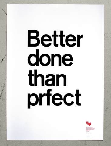
I’m so fed
up with marketing people running projects without acknowledging that we designers might have an idea or two about what communicates and what doesn’t. They’ve been told by tech guys and lazy web-designers that things have to be simplified to work on screens. This is knowledge from the 90s and not true anymore. Risk and guts have been replaced by bullshit narratives” invented by people who’ve never taken a risk in their lives. This is the blandification of our world, where fun has to be taken out of the equation because it cannot be quantified. No consumer cares about a company’s internal reorganization, they want to like a brand. When all brands are beige, the beigest one will not win, but will be forgotten. The enshittification of our world is run by people who read spreadsheets in bed and look at their smartphones to tell the weather instead of sticking their heads out of the window.

Sometimes I’m glad that I am old and don’t have to take orders from gutless employed managers anymore. My best cli­ents were those I could argue with. It wasn’t about winning or being right, it was about doing the best work.

Thank you Adobe, Audi, VW, Mercedes, Deutsche Bahn, BVG, Bosch, Ottobock, The Eco­nomist, wdr, zdf, FontShop, Gravis, Tegut, Messe Frankfurt … and all the other ­cli­ents I worked with, not just for.


The word enshittification was coined by Cory Doctorow @doctorow.


#29 Townhouse zu verkaufen/for sale

ein kleiner Wolkenkratzer in Berlin-Mitte, gleich neben dem Außenministerium, ist zu verkaufen. Näheres per Email: email hidden; JavaScript is required
a little skyscraper
in the centre of Berlin, right by the Aussenministerium/Foreign Office is for sale. Details via email hidden; JavaScript is required

#28 Make great things again in 2025

The card is printed letterpress in gold ink on a Boston platen at our letterpress workshop HackingGutenberg. Set in 48p EDE caps, 24p Akzidenz Grotesk Halbfett and 9p Ludlow Garamond. I forgot to photograph/scan a good print before they had all been mailed, so the reproduction above doesn’t do it justice. While gold is fun to print letterpress, it doesn’t like being photographed.

After we moved from the very big (400sqm – 4000sq ft) workshop to a much smaller one (95sqm) right next door, Hacking Gutenberg is only slowly getting back to work. The website needs a total redesign – mainly because the photographs need to show the new space – and the cases of type are split between the studio space on the groundfloor and the cellar. We’ll have to decide between type – metal and wood – that we need frequently for workshops and all my favourite type that is too delicate, rare or weird for anybody else to touch, let alone use.

Originally, Spiekileaks was meant to be just for my private rumblings (I simply couldn’t resist the name …), the much older Spiekerblog was my original blog, and then there is Hacking Gutenberg, the shop and the workshop. All done at different times with different tools for different purposes. Every time I open the older blog, I will have forgotten how this particular system works. Perhaps time to consolidate? ★

#27 Cut the meaningless superlatives or it’s through the window with you…

Imprecise language is the expression of an imprecise mind. So my mother always said, and mothers tend to know these things. The word itself is more precise than its frequently used synonym, unprecise, which is a weird mix of Latin (praecisio, a cutting-off) and proto-Germanic. Whenever the headlines announce the best movie (songs/ actors/ goals/ cars) of all time’, I know what they are trying to say, but our time isn’t up yet and there will be other good movies, songs, et cetera. How can one call something the most expensive transfer of all time’ or the most sold car ever’, when we know that there will never be an end to unbelievable (incredible?) transfer prices and that the price of cars will keep going up?

I know I’m being over-Teutonic here and we all know that these exaggerations are only thoughtless, stereotypical expressions (by the way: aren’t those two /g’s in exaggeration’ totally and unnecessarily, ahem, exaggerated?), but the overuse of adjectives, especially when it comes to superlatives, will eventually make all of them redundant.

We should treat language like fractions. Nobody says two halves’ or four quarters’ (unless they are talking about sports) when speaking about one whole thing. So why say ‘… the well-known, award-winning artist…’? If the artist is, indeed, well-known, there is no need to mention that well-known fact. And the reader would already know what sort of award they have won. It means nothing unless there were some proof attached. What awards did they win? Best halloween costume at primary school? The Nobel Prize? 

Just look at any architect’s or designer’s website or brochure: not only are they all award-winning, but they also always work in close cooperation with their clients to maximise benefit not only for their businesses but also for the environment while emphasising a responsible use of resources because they want to leave a better world behind for our children’s children.

Most of that self-praise could be cut to about two lines, the remainder of the wordage then going to feed a bullshit generator, which is the closest thing mankind will ever have to a perpetuum mobile, feeding itself, as it does, with redundant words. Whenever I hear a client say that they provide a dynamic work environment for their employees to grow in while working closely with their customers to make this a better world, et cetera, I get an urge to re-introduce the old tradition of defenestration – that is, throwing people from windows. (It wasn’t necessarily fatal because buildings weren’t as tall as present-day Shards et al, but it was certainly spectacular and memorable. More so for those on the receiving end, but it also never failed to make an impression on those below.)

Once the PR people have run out of words like award-winning, well-known or celebrated, they have only one level left: legendary. That, however, not only describes someone as a known quantity, but also implies unreal, as in never really having existed. It isn’t sheer modesty that has me cringing when I read – or hear – this about me (I am 77, by the way), but that it is pretty impossible to live up to such a superlative. Unless you die, of course.

Only a dead designer can become the best designer ever. ★

#26 Die Ökonomie des Meckerns. The Economy of Complaining

Die Ökonomie des Meckerns ist ineffektiv, kontraproduktiv und zerstörerisch. Sie untergräbt die Grundlagen des Wohlstands. Deshalb sind gute Botschaften so wichtig. Sag den Leuten, dass das System manipuliert ist und sie werden sich weniger anstrengen. Setz dich hingegen für Eigenverantwortung ein und sie werden ihre Ansprüche hochschrauben.
Eine optimistische Vision der Wirtschaft fördert die Risi­ko­toleranz und spornt den Ehrgeiz an. Meckern wirkt wie eine Bremse, während wir mit etwas mehr geistiger Beweglichkeit schnell für neuen Antrieb sorgen könnten.

The economy of complaining is ineffective, counterproductive and destructive. It undermines the foundations of prosperity. That’s why good messages are so important. Tell people that the system is rigged and they will make less effort. Advocate personal responsibility and they will raise their standards.
An optimistic vision of the economy encourages risk tolerance and spurs ambition. Complaining acts as a brake, whereas with a little more mental agility we could quickly provide new drive. ★

Letterpress poster Hacking Gutenberg

#25 New Type for New Thinking

An early version of Futura shows experimental letterforms that owe more to the atmosphere of experiment and change in the 20s than to the requirements of legible type.

TOC 9, the next book for TOC The Other Collection, is Wolfgang Eilenberger’s Time of the Magicians – The Great Decade of Philosophy 1919 – 1929. The original book was written in German and the translation keeps many words and concepts that are difficult or impossible to translate, like Sein or Dasein or even more difficult: Es gibt. No point trying to explain those expression here – just get the book. A lot of the pro­tagonists are German: Benjamin, Cassirer, Heidegger, Wittgenstein and others appear, while Hegel, Nietzsche, Kant et al are frequently quoted. 

The decade after World War I was exciting, messy, wild, new. The survivors of the terrific fighting in the world’s first fully mechanised war had often been wounded and traumatised. It was a time to explore how human thinking might have to be re-invented and how the world should be re-built. Art, design and architecture were re-imagined – the Bauhaus in Weimar and Dessau defined those movements, including a new look at type and typography. 

Shouldn’t a book about New Thinking be set in a New Typeface? New ideas about typography also reflected new thinking, integrating images and finding its own expressions, away from ornamentation and decoration.

The Bauhaus experimented with new typefaces, but never managed the step from theory and sketches to working, legible type. It took until 1927 for the first really new typeface to be released, appropriately named Futura and advertised as the Type for the new Age Die Schrift der neuen Zeit.

The registration with the Association of German Typefoundries from November 1927 shows it as Renner-Futura, named for its designer, Paul Renner. The version intended to be used for long text in books and magazined was Futura Buchschrift, released much later, in 1933. It was made available for all line-casting machines of the day – Intertype, Linotype, and Typograph, making it suitable for setting books and other long text.

Its radical departure from the traditional serif faces hadn’t initially suggested its use for long text. German books, newspapers and magazines were set in Fraktur, with only foreign languages and names in serif type – which the non-German world called Antiqua.
Renner’s capitals are Roman capitals, its serifs and the contrast removed. He himself called Futura a Serifenlose Antiqua – a non-serif Roman.
The illu­stra­­tion of the basic geometric shapes – square, triangle, circle – is a nod to the Zeitgeist which was trying to make new typefaces just using those shapes but which never yielded any usable text faces.


The books I have so far designed for TOC are set in traditional serif faces, albeit those that are digital re-interpretations by today’s type-designers. Futura was the obvious candidate for this text which looks at the first decade after WW1, but I could not remember seeing that typeface work in longer text, printed offset. Type is never black enough when printed with water, as offset does, and neither photosetting nor digital versions of Futura had managed to overcome the pale impression that its skeletal letterforms left on the page.

Then Kris Sowersby came to my rescue. He had already shown how to manage to revive a perfect typeface with his Söhne, a contemporary interpretation of my favourite typeface, Akzidenz Grotesk. And I had used his Signifier (also the type this column is set in) to set our third book, John Banville’s The Sea. I am in the middle of setting the Eilenberger book, using Kris’s version of the Type for the New Age which he calls The Future. I’m using the weight he calls Regular. 

A Regular or Book weight did not exist when Futura was first announced at the end of 1927 (it wasn’t cast until 1928), there were only the mager (light), halbfett (medium) and fett (bold) weights. In 1933 Futura Buchschrift came out – appropriately named for setting long text. It was available for machine setting on all three existing systems: Intertype, Linotype, and Typograph.

When we print on our 1954 Heidelberg Cylinder press from polymer plates, we get exactly the same impression you would have seen when printing from metal type. Before I commit to a new, untried typeface, we print a signature – 8 pages – on the Heidelberg, from our polymer plates, and on the original paper. When I design for offset printing, I always look for a typeface with a good text weight because offset printing tends to make the type look lighter than it will do on screen or on an office printer. One of our favourite typefaces has therefore always been Kai Bernau’s Lyon: it features two weights for text: Lyon Text Regular and Lyon Text Regular No2. No2 has that little extra heft necessary for setting text sizes up to 14pt and printing offset. Printed letterpress on the Heidelberg, however, the lighter Lyon Text Regular will gain a little weight from the slight impression into the paper and the resulting blackness of the type. The two weights have to be different to appear the same.

Futura Buchschrift was designed for letterpress printing, because that is how books were made at the time, and it ended up looking slightly emaciated when photoset and printed offset from the 70s onwards. Some of that had to do with the design of photosetting fonts which had often been adapted from the original drawings – in theory a good thing, but usually not taking into account the distortions occuring during reproduction, plate-making and printing. The first digital types from the 80s after the arrival of PostScript technology suffered from the same malaise. Today once again we see fonts with size-specific design, sometimes made using the Variable Type format.

Kris did his homework when he designed The Future, and I’m expecting his version to show that this new Futura can be used for setting long text again, as long as it fits the topic and all the design parameters consider its simple yet complex character. Printing it letterpress will help give the Type for the New Age a new life. It certainly fits today’s requirements if handled well. ★